29 Statistical reporting
29.1 Objectives
Questions
- How do I consistently report on statistical results?
Objectives
- Be able to follow a consistent analysis methodology in R
- Report the statistical results in a clear and structured way
29.2 Purpose and aim
To practise the statistical methods we have covered in the previous sessions and to produce consistent statistical reports.
29.3 Data and hypotheses
The first section uses data in the file data/raw/CS6-NPYield.csv. This is a dataset comprising 24 observations of three variables (one dependent and two predictor). This records the yield of peas (in pounds/plot) for different plots. For each plot a record of whether nitrogen and/or phosphate fertiliser has been added.
29.4 Analysis methodology
Carry out the analysis suggested in the following steps and confirm that your analysis matches the text in this section.
29.4.1 Step 1 - Identify the variables and the question to be explored
- Load in the dataset and look at the raw data
- Confirm that the
NPYielddataset contains 24 observations of 3 variables
- Confirm that the
- Check the names and types of the variables
-
yieldis a continuous variable -
NitandPhoare categorical (factor) predictor variables
-
- The obvious question to ask is how do the variables
NitandPhoaffect the variableyield?
29.4.2 Step 2 – Describe the data
- Plot the data
- Plot the effects of the individual predictor variables first. Here box plots of
yieldagainstNitandyieldagainstPhowould be appropriate. - Plot the effects of the interactions between pairs of predictor variables. Here an interaction plot would be appropriate since the two predictor variables are both categorical
- Plot the effects of the individual predictor variables first. Here box plots of
- Carry out any descriptive statistics that you may find useful
- Calculate means, variances, ranges etc. Here we’re not going to bother with this given the simplicity of the dataset.
- Consider whether there appear to be any significant effects of any of the variables
- There appears to be an effect of nitrogen
- There does not appear to be an effect of phosphate
- There may be an interaction effect but it is not clear
29.4.3 Step 3 - Perform tests and or fit models
- Select a test appropriate to the data that you have
- Here, with a single continuous response variable and two categorical variables we have two options: a two-way ANOVA test or a linear model (I’d always go for a linear model framework). We’ll first fit a model with all interactions
lm(yield ~ Nit * Pho)and then look at model reduction to see if all of the terms are valid.
- Here, with a single continuous response variable and two categorical variables we have two options: a two-way ANOVA test or a linear model (I’d always go for a linear model framework). We’ll first fit a model with all interactions
- Assess results of model fit
- Identify any significant effects. Here the full model is not significant and after performing backwards stepwise elimination we find that the minimal model is
yield ~ Nit. - Determine the coefficients of the best fitting model. Here we find that the formula is given by:
- Identify any significant effects. Here the full model is not significant and after performing backwards stepwise elimination we find that the minimal model is
29.5 Writing up the analysis
There are four broad sections to any statistical report:
- Introduction
- Methods & Results
- Discussion
- Appendix
29.5.1 Introduction
Here we aim to:
- Describe what the data represent and any information on how it was collected
- State the question to be investigated.
Always try to keep the language non-technical
For example:
Introduction
The aim of this analysis is to investigate the relationship between the yield of peas and the addition of fertilisers. The yield of peas in pounds/plot is recorded for 24 plots and used as the response variable. Two predictor variables are thought to potentially have an effect: The addition of a fixed amount of a nitrogen based fertiliser and the addition of a fixed amount of a phosphate based fertiliser.
29.5.2 Methods and results
In this section we aim to:
- Describe data using descriptive statistics and plots
- Describe/state procedures undertaken
- e.g. “Fit linear model with all interactions between variables”
- Present figures and state key results
- e.g. Show lines of best fit on a scatter graph or state whether F-statistics are significant alongside the relevant p-values.
- Produce diagnostic plots and/or results of assumption tests
This section should contain enough detail to enable someone else to replicate the results. No R output needs to be included here.
In the example below I am using ggplot2 and patchwork, because it makes it a lot easier to produce nice graphs. It is possible to do similar things in using the base R syntax, but you’ll probably find that composing your plot into panels is best done with an external programme.
For example:
Methods and results
The response variable yield was plotted against the two categorical variables Pho and Nit independently, and the means of the different categorical combinations were calculated and plotted. These are shown in Figure 1:
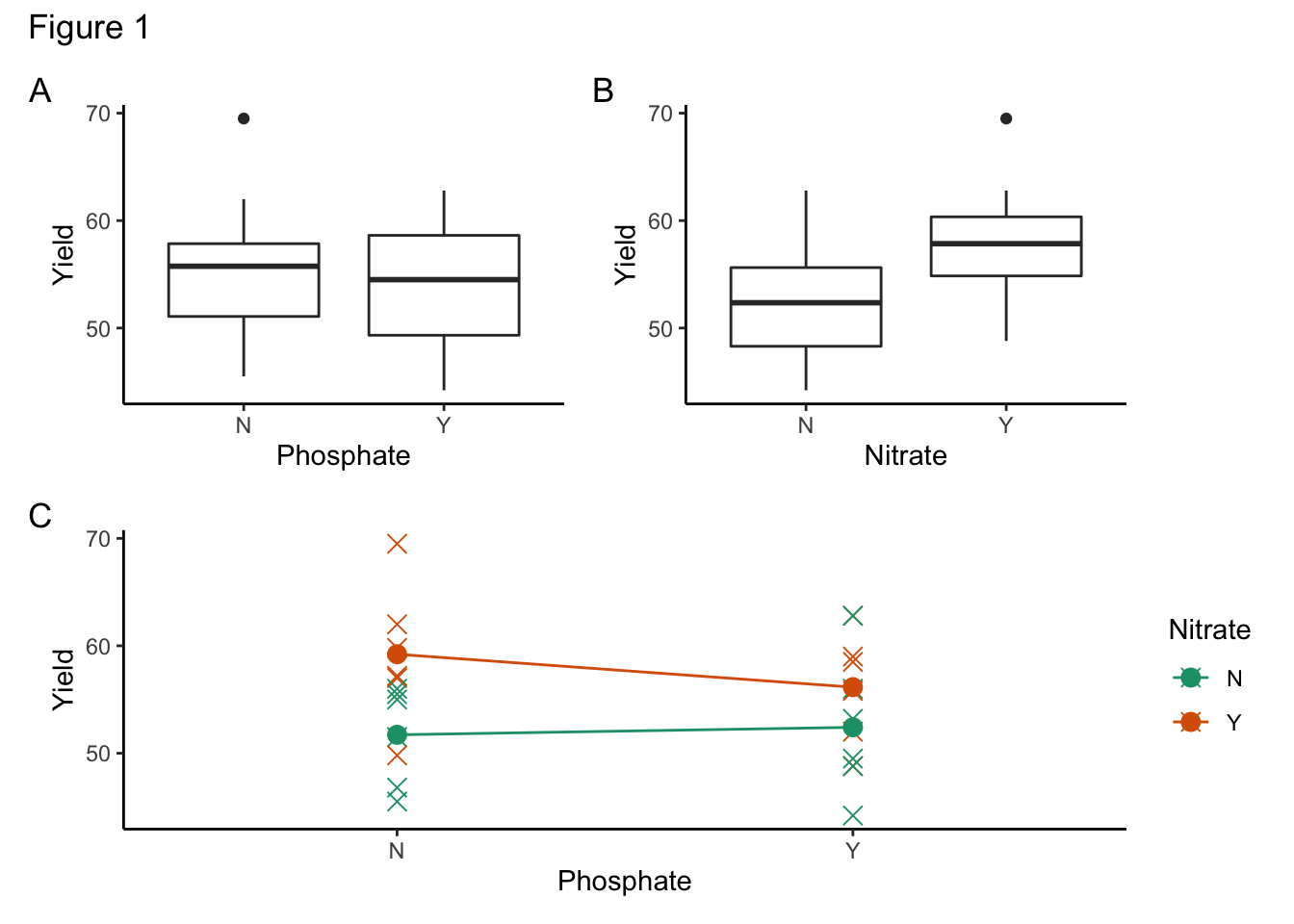
Figure 1a appears to suggest that there isn’t an effect of phosphate on yield. Figure 1b indicates that there might be an effect of nitrogen on yield. Figure 1c suggests that there might be an interaction effect of nitrogen and phosphate on yield, although this might be due to the presence of an outlier in the (No Phosphate & Nitrogen) group.
A full linear model containing both variables and the interaction between them was fitted to the data (yield ~ Nit + Pho + Nit:Pho) and the model assumptions were checked using a full residual analysis (see Figure 2). The assumptions of equal variance and normality appear to be met, suggesting that a linear model analysis may be adequate for the data.
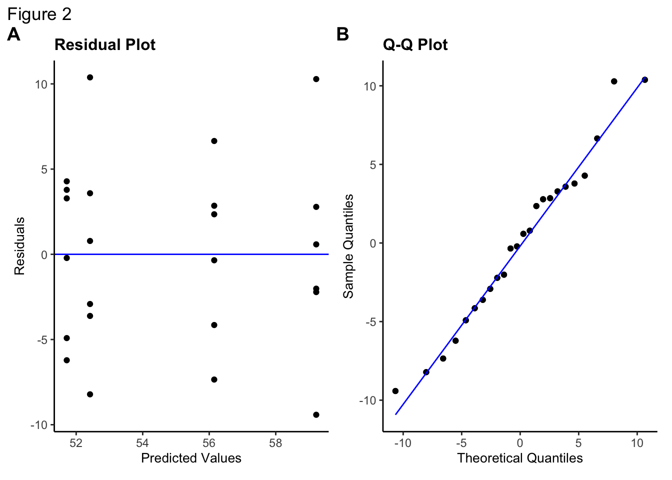
The ANOVA analysis for the full model compared with the null model results gives a non-significant result (F3,20 = 2.21, p = 0.12) suggesting that there is insufficient evidence that yield is affected by all of the variables.
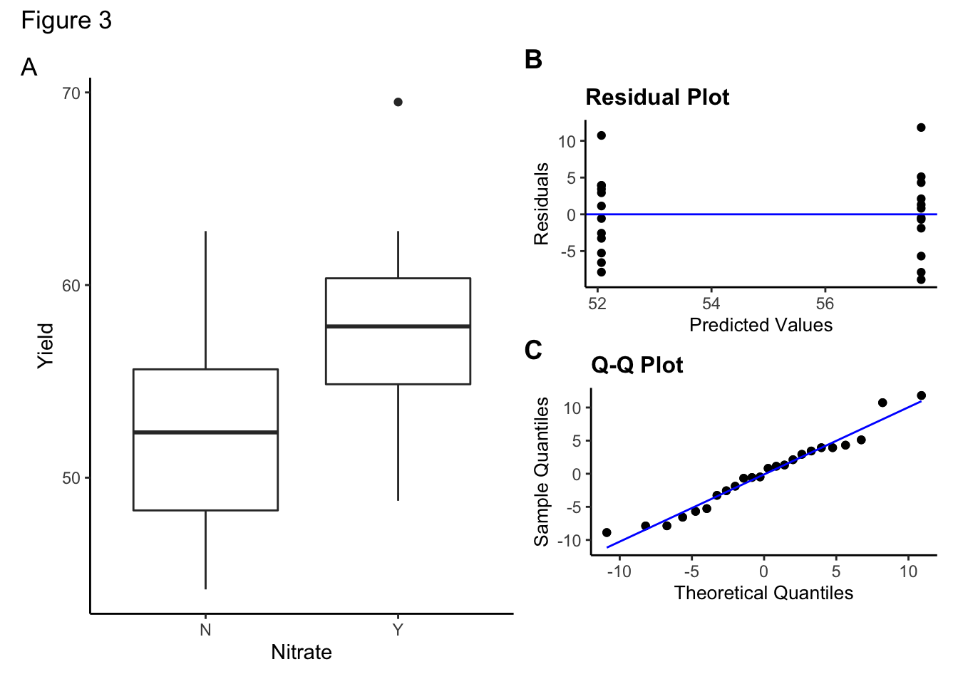
Backwards stepwise elimination was then used to find the minimal model. Both the interaction between Nitrogen and Phosphate and Phosphate terms on yield were not found to be significant and the minimal model was found to be:
\[\begin{equation} yield ~ Nit \end{equation}\]
with the variable Nit being a significant predictor of yield (F1,22 = 6.06, p = 0.02).
\[\begin{equation} yield = 52.07 + \binom{0}{5.62} \binom{Nit:N}{Nit:Y} \end{equation}\]
A box plot of the final model result (a) alongside the diagnostic plots for this minimal model (b, c) are shown in Figure 3. The assumptions of equal variance and normality still appear to be met, again suggesting that a linear model analysis is appropriate for the data.
29.5.3 Discussion
In this section we aim to:
- Summarise the results in the context of the question, i.e. What did you find?
- Discuss results of model assumption tests. Were these met? Is anything slightly dodgy?
- Discuss data limitations, e.g. number of data points, presence of outliers etc.
For example:
Discussion
The analysis shows that a linear model may be adequate for the data and that the addition of a Nitrogen based fertiliser is a significant predictor of pea yield, whereas a Phosphate based fertiliser does not have a statistically significant effect. It can be seen that the addition of Nitrogen appears to increase the yield. It is interesting to note that whilst a reduced model has been shown to be statistically significant, the full model was not significant when compared with a null model. The number of data points is relatively small for a full interaction analysis (only 6 points per 2-way classification), and so repeating the analysis with a larger number of observations might be beneficial.
29.5.4 Appendix
This section is not always necessary / included but here we have the option to:
- Add all R output here, i.e. Full ANOVA tables and printed output
- Could include a copy of any R script here if you’ve done something clever in terms of data manipulation. Again this would be so that you can aid reproducibility of any results you’ve obtained
29.6 Exercise: cars 2 variables
Exercise 29.1 Investigate the relationship between the continuous response variable mpg and the categorical predictor variables cyl and gear.
The data can be found in data/raw/CS6-cars2var.csv. In this dataset:
-
mpgis miles per gallon -
cylin number of cylinders (a categorical variable) -
gearis number of gears (a categorical variable) -
wtis weight of car (a continuous variable)
Hint
When you load the datasets into R, check that each variable has been interpreted correctly. Specifically check that categorical variables have been loaded as factors and not as numbers. Specifically, you may have to force a variable to be interpreted as a factor using a line of code such as: cars3$gear <- factor(cars3$gear)
29.7 Exercise: cars 3 variables
Exercise 29.2 This dataset now also includes the continuous predictor variable wt. Investigate the relationships between all four variables.
The data can be found in data/raw/CS6-cars3var.csv. In this dataset:
-
mpgis miles per gallon -
cylin number of cylinders (a categorical variable) -
gearis number of gears (a categorical variable) -
wtis weight of car (a continuous variable)
Hint
For a dataset with three predictor variables (A, B, C) and one response variables (Y) there will be six initial plots:
- 3 individual plots:
Yvs.A,Yvs.B,Yvs.C - 3 two-variable plots:
Yvs.A&B,Yvs.A&C,Yvs.B&C
We know how to look at two types of two-variable plots:
- categorical x categorical (interaction.plot)
- categorical x continuous (see linear model practical)
But we won’t usually plot continuous x continuous two-variable plots (since this would require 3D plotting), but if you’re interested then have a look at the plot3d() command in the rgl library.
29.8 Key points
- A useful analysis methodology would be:
- identify the variables and the question to be explored
- describe the data (plots, summaries)
- perform tests or fit models
- check assumptions of the tests/models
- Writing up the statistical analysis often follows this structure:
- Introduction (description of data in non-technical way; collection methods; question to answer)
- Methods & Results (description of data; procedures; present figures and key results; results of assumptions checks)
- Discussion (summarise results; discuss results of assumptions; limitations of data)
- Appendix (optional, can include R output)