12 ANOVA
12.1 Objectives
Questions
- How do I analyse multiple samples of continuous data?
- What is an ANOVA?
- How do I check for differences between groups?
Objectives
- Be able to perform an ANOVA in R
- Understand the ANOVA output and evaluate the assumptions
- Understand what post-hoc testing is and how to do this in R
12.2 Purpose and aim
Analysis of variance or ANOVA is a test than can be used when we have multiple samples of continuous data. Whilst it is possible to use ANOVA with only two samples, it is generally used when we have three or more groups. It is used to find out if the samples came from parent distributions with the same mean. It can be thought of as a generalisation of the two-sample Student’s t-test.
12.3 Section commands
We’ll be using several libraries in this section. Make sure that you have installed them with install.packages("name_of_package").
After installation, make sure to load them with the library() command, as shown below.
New functions used in this section are also shown.
| Function & libraries | Description |
|---|---|
library(tidyverse) |
|
library(rstatix) |
|
library(ggResidpanel) |
|
anova() |
Carries out an ANOVA on a linear model |
12.4 Data and hypotheses
For example, suppose we measure the feeding rate of oyster catchers (shellfish per hour) at three sites characterised by their degree of shelter from the wind, imaginatively called exposed (E), partially sheltered (P) and sheltered (S). We want to test whether the data support the hypothesis that feeding rates don’t differ between locations. We form the following null and alternative hypotheses:
- \(H_0\): The mean feeding rates at all three sites is the same \(\mu E = \mu P = \mu S\)
- \(H_1\): The mean feeding rates are not all equal.
We will use a one-way ANOVA test to check this.
- We use a one-way ANOVA test because we only have one predictor variable (the categorical variable location).
- We’re using ANOVA because we have more than two groups and we don’t know any better yet with respect to the exact assumptions.
The data are stored in the file CS2-oystercatcher.csv.
12.5 Summarise and visualise
First we read in the data.
# load data
oystercatcher <- read_csv("data/tidy/CS2-oystercatcher.csv")

# and have a look
oystercatcher
## # A tibble: 15 × 3
## id feeding site
## <dbl> <dbl> <chr>
## 1 1 14.2 Exposed
## 2 2 16.5 Exposed
## 3 3 9.3 Exposed
## 4 4 15.1 Exposed
## 5 5 13.4 Exposed
## 6 6 18.4 Partial
## 7 7 13 Partial
## 8 8 17.4 Partial
## 9 9 20.4 Partial
## 10 10 16.5 Partial
## 11 11 24.1 Sheltered
## 12 12 22.2 Sheltered
## 13 13 25.3 Sheltered
## 14 14 25.1 Sheltered
## 15 15 21.5 ShelteredThe oystercatcher data set contains three columns:
- a unique ID column
id - a
feedingcolumn containing feeding rates - a
sitecolumn with information on the amount of shelter of the feeding location
First, we get some basic descriptive statistics:
# get some basic descriptive statistics
oystercatcher %>%
  select(-id) %>%
  group_by(site) %>%
  get_summary_stats(type = "common")
## # A tibble: 3 × 11
## site variable n min max median iqr mean sd se ci
## <chr> <chr> <dbl> <dbl> <dbl> <dbl> <dbl> <dbl> <dbl> <dbl> <dbl>
## 1 Exposed feeding 5 9.3 16.5 14.2 1.7 13.7 2.72 1.21 3.37
## 2 Partial feeding 5 13 20.4 17.4 1.9 17.1 2.73 1.22 3.39
## 3 Sheltered feeding 5 21.5 25.3 24.1 2.9 23.6 1.71 0.767 2.13Next, we plot the data by site:
# plot the data
oystercatcher %>%
  ggplot(aes(x = site, y = feeding)) +
  geom_boxplot()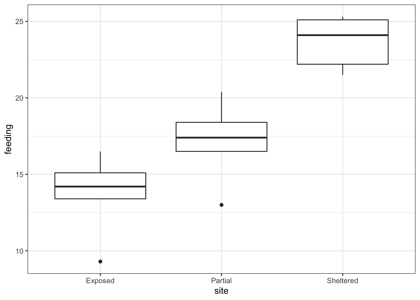
Looking at the data, there appears to be a noticeable difference in feeding rates between the three sites. We would probably expect a reasonably significant statistical result here.
12.6 Assumptions
To use an ANOVA test, we have to make three assumptions:
- The parent distributions from which the samples are taken are normally distributed
- Each data point in the samples is independent of the others
- The parent distributions should have the same variance
In a similar way to the two-sample tests we will consider the normality and equality of variance assumptions both using tests and by graphical inspection (and ignore the independence assumption).
12.6.1 Normality
First we perform a Shapiro-Wilk test on each site separately.
# Shapiro-Wilk test on each site
oystercatcher %>%
  select(-id) %>%
  group_by(site) %>%
  shapiro_test(feeding)
We can see that all three groups appear to be normally distributed which is good.
For ANOVA however, considering each group in turn is often considered quite excessive and, in most cases, it is sufficient to consider the normality of the combined set of residuals from the data. We’ll explain residuals properly in the next session but effectively they are the difference between each data point and its group mean. The residuals can be obtained directly from a linear model fitted to the data.
So, we create a linear model, extract the residuals and check their normality:
# define the model
lm_oystercatcher <- lm(feeding ~ site,
                       data = oystercatcher)

# extract the residuals
resid_oyster <- residuals(lm_oystercatcher)

# perform Shapiro-Wilk test on residuals
resid_oyster %>%
  shapiro_test()
## # A tibble: 1 × 3
## variable statistic p.value
## <chr> <dbl> <dbl>
## 1 . 0.936 0.334Again, we can see that the combined residuals from all three groups appear to be normally distributed (which is as we would have expected given that they were all normally distributed individually!)
12.6.2 Equality of Variance
We now test for equality of variance using Bartlett’s test (since we’ve just found that all of the individual groups are normally distributed).
Perform Bartlett’s test on the data:
# check equality of variance
bartlett.test(feeding ~ site,
              data = oystercatcher)
##
## Bartlett test of homogeneity of variances
##
## data: feeding by site
## Bartlett's K-squared = 0.90632, df = 2, p-value = 0.6356Where the relevant p-value is given on the 3rd line. Here we see that each group do appear to have the same variance.
12.6.3 Graphical interpretation and diagnostic Plots
R provides a convenient set of graphs that allow us to assess these assumptions graphically. If we simply ask R to plot the lm object we have created, then we can see some of these diagnostic plots.
There are a variety of ways that we can create diagnostic plots. There is no right or wrong - just preference.
The functionality of base R is really helpful, and it’s easy to create diagnostic plots with the built-in functionality. For example, you can create a set of basic diagnostic plots using:
# create a neat 2x2 window
par(mfrow = c(2,2))
# create the diagnostic plots
plot(model_name)
# and return the window back to normal
par(mfrow = c(1,1))
In the first session we already created diagnostic Q-Q plots from our data, using residpanel(plots = "qq"), using the ggResidPanel package. For consistency with the tidyverse syntax used, we will use this from now on, but it is equally valid to use the base R functions.
Create the standard set diagnostic plots using ggResidPanel:
lm_oystercatcher %>%
  resid_panel(plots = c("resid", "qq", "ls", "cookd"),
              smoother = TRUE)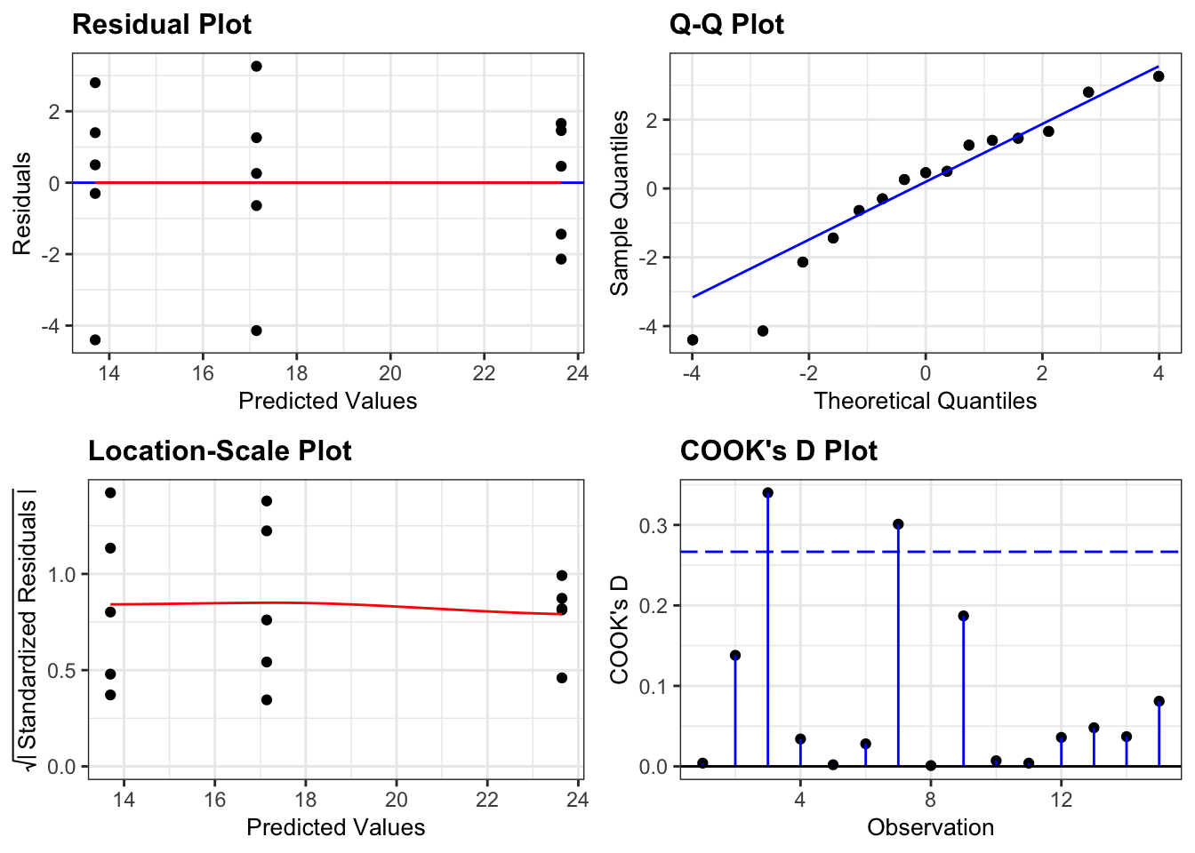
- The top left graph plots the Residuals plot. If the data are best explained by a straight line then there should be a uniform distribution of points above and below the horizontal blue line (and if there are sufficient points then the red line, which is a smoother line, should be on top of the blue line).
- The top right graph shows the Q-Q plot which allows a visual inspection of normality. If the residuals are normally distributed, then the points should lie on the diagonal dotted line.
- The bottom left Location-scale graph allows us to investigate whether there is any correlation between the residuals and the predicted values and whether the variance of the residuals changes significantly. If not, then the red line should be horizontal. If there is any correlation or change in variance then the red line will not be horizontal.
- The last graph shows the Cook’s distance and tests if any one point has an unnecessarily large effect on the fit. The important aspect here is to see if any points are larger than 0.5 (meaning you’d have to be careful) or 1.0 (meaning you’d definitely have to check if that point has an large effect on the model). If not, then no point has undue influence.
The default equivalent in base R is as follows:
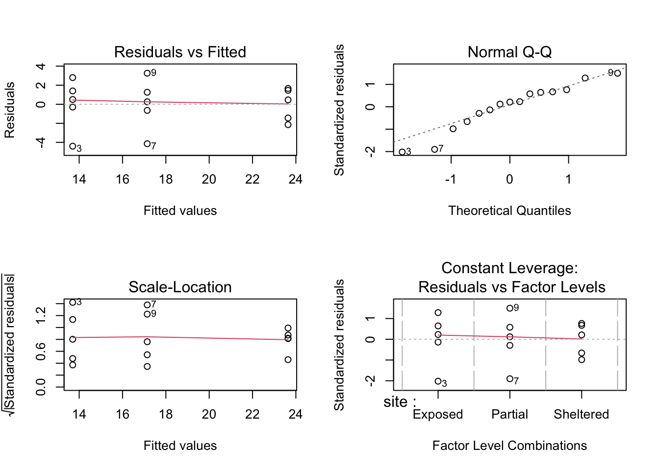
The second line creates the three diagnostic plots (it actually tries to create four plots but can’t do that for this dataset so you’ll also see some warning text output to the screen (something about hat values). I’ll go through this in the next session where it’s easier to explain).
- In this example, two of the plots (top-left and bottom-left) show effectively the same thing: what the distribution of data between each group look like. These allow an informal check on the equality of variance assumption.
- For the top-left graph we want all data to be symmetric about the 0 horizontal line and for the spread to be the same (please ignore the red line; it is an unhelpful addition to these graphs).
- For the bottom-left graph, we will look at the red line as we want it to be approximately horizontal.
- The top-right graph is a familiar Q-Q plot that we used previously to assess normality, and this looks at the combined residuals from all of the groups (in much the same way as we looked at the Shapiro-Wilk test on the combined residuals).
We can see that these graphs are very much in line with what we’ve just looked at using the test, which is reassuring. The groups all appear to have the same spread of data, and whilst the Q-Q plot isn’t perfect, it appears that the assumption of normality is alright.
At this stage, I should point out that I nearly always stick with the graphical method for assessing the assumptions of a test. Assumptions are rarely either completely met or not met and there is always some degree of personal assessment.
Whilst the formal statistical tests (like Shapiro) are technically fine, they can often create a false sense of things being absolutely right or wrong in spite of the fact that they themselves are still probabilistic statistical tests. In these exercises we are using both approaches whilst you gain confidence and experience in interpreting the graphical output and whilst it is absolutely fine to use both in the future I would strongly recommend that you don’t rely solely on the statistical tests in isolation.
12.7 Implement test
Perform an ANOVA test on the data:
anova(lm_oystercatcher)- The
anova()command takes a linear model object as its main argument
12.8 Interpret output and report results
This is the output that you should now see in the console window:
## Analysis of Variance Table
##
## Response: feeding
##           Df  Sum Sq Mean Sq F value    Pr(>F)
## site       2 254.812 127.406  21.508 0.0001077 ***
## Residuals 12  71.084   5.924
## ---
## Signif. codes: 0 '***' 0.001 '**' 0.01 '*' 0.05 '.' 0.1 ' ' 1- The 1st line just tells you the that this is an ANOVA test
- The 2nd line tells you what the response variable is (in this case feeding)
- The 3rd, 4th and 5th lines are an ANOVA table which contain some useful values:
- The
Dfcolumn contains the degrees of freedom values on each row, 2 and 12 (which we’ll need for the reporting) - The
Fvalue column contains the F statistic, 21.508 (which again we’ll need for reporting). - The p-value is 0.0001077 and is the number directly under the
Pr(>F)on the 4th line. - The other values in the table (in the
Sum SqandMean Sq) columns are used to calculate the F statistic itself and we don’t need to know these.
- The
- The 6th line has some symbolic codes to represent how big (small) the p-value is; so, a p-value smaller than 0.001 would have a *** symbol next to it (which ours does). Whereas if the p-value was between 0.01 and 0.05 then there would simply be a * character next to it, etc. Thankfully we can all cope with actual numbers and don’t need a short-hand code to determine the reporting of our experiments (please tell me that’s true…!)
Again, the p-value is what we’re most interested in here and shows us the probability of getting samples such as ours if the null hypothesis were actually true.
Since the p-value is very small (much smaller than the standard significance level of 0.05) we can say “that it is very unlikely that these three samples came from the same parent distribution” and as such we can reject our null hypothesis and state that:
A one-way ANOVA showed that the mean feeding rate of oystercatchers differed significantly between locations (F = 21.51, df = 2, 12, p = 0.00011).
Note that we have included (in brackets) information on the test statistic (F = 21.51), both degrees of freedom (df = 2, 12), and the p-value (p = 0.00011).
12.9 Post-hoc testing (Tukey’s rank test)
One drawback with using an ANOVA test is that it only tests to see if all of the means are the same, and if we get a significant result using ANOVA then all we can say is that not all of the means are the same, rather than anything about how the pairs of groups differ. For example, consider the following boxplot for three samples.

Each group is a random sample of 20 points from a normal distribution with variance 1. Groups 1 and 2 come from a parent population with mean 0 whereas group 3 come from a parent population with mean 2. The data clearly satisfy the assumptions of an ANOVA test.
12.9.1 Read in the data and plot
# load the data
tukey <- read_csv("data/tidy/CS2-tukey.csv")

# have a look at the data
tukey
## # A tibble: 60 × 3
## id response group
## <dbl> <dbl> <chr>
## 1 1 1.58 sample1
## 2 2 0.380 sample1
## 3 3 -0.997 sample1
## 4 4 -0.771 sample1
## 5 5 0.169 sample1
## 6 6 -0.698 sample1
## 7 7 -0.167 sample1
## 8 8 1.38 sample1
## 9 9 -0.839 sample1
## 10 10 -1.05 sample1
## # … with 50 more rows
# plot the data
tukey %>%
  ggplot(aes(x = group, y = response)) +
  geom_boxplot()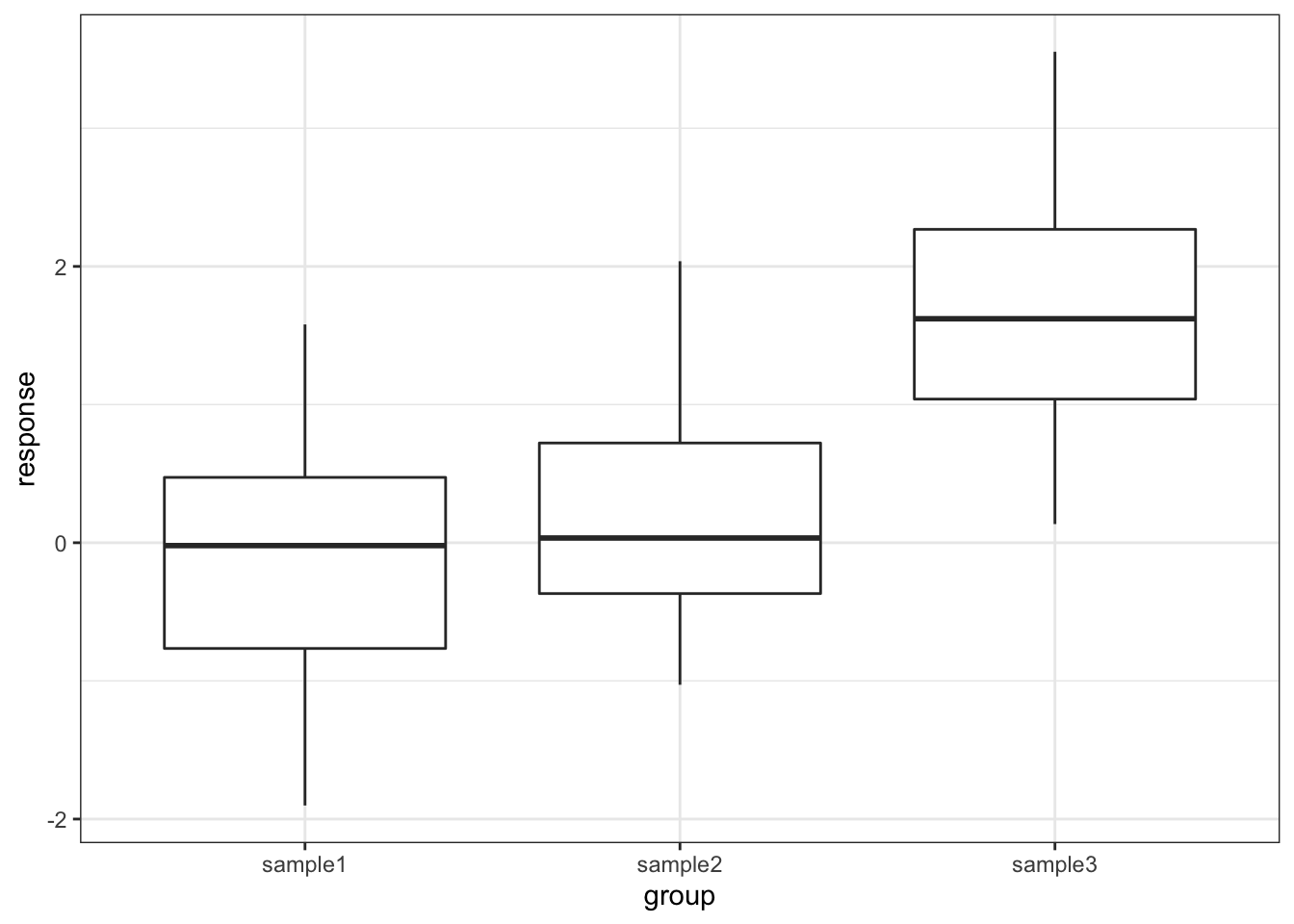
12.9.2 Test for a significant difference in group means
# create a linear model
lm_tukey <- lm(response ~ group,
               data = tukey)

# perform an ANOVA
anova(lm_tukey)
## Analysis of Variance Table
##
## Response: response
## Df Sum Sq Mean Sq F value Pr(>F)
## group 2 33.850 16.9250 20.16 2.392e-07 ***
## Residuals 57 47.854 0.8395
## ---
## Signif. codes: 0 '***' 0.001 '**' 0.01 '*' 0.05 '.' 0.1 ' ' 1Here we have a p-value of 2.39 \(\cdot\) 10-7 and so the test has very conclusively rejected the hypothesis that all means are equal.
However, this was not due to all of the sample means being different, but rather just because one of the groups is very different from the others. In order to drill down and investigate this further we use a new test called Tukey’s range test (or Tukey’s honest significant difference test – this always makes me think of some terrible cowboy/western dialogue). This will compare all of the groups in a pairwise fashion and reports on whether a significant difference exists.
12.9.3 Performing Tukey’s test
## # A tibble: 3 × 9
##   term  group1  group2  null.value estimate conf.low conf.high       p.adj
## * <chr> <chr>   <chr>        <dbl>    <dbl>    <dbl>     <dbl>       <dbl>
## 1 group sample1 sample2          0    0.304   -0.393      1.00 0.55
## 2 group sample1 sample3          0    1.72     1.03       2.42 0.000000522
## 3 group sample2 sample3          0    1.42     0.722      2.12 0.0000246
## # … with 1 more variable: p.adj.signif <chr>
The tukey_hsd() function takes our linear model (lm_tukey) as its input. The output is a pair-by-pair comparison between the different groups (samples 1 to 3). We are interested in the p.adj column, which gives us the adjusted p-value. The null hypothesis in each case is that there is no difference in the mean between the two groups. As we can see the first row shows that there isn’t a significant difference between sample1 and sample2 but the 2nd and 3rd rows show that there is a significant difference between sample1 and sample3, as well as sample2 and sample3. This matches with what we expected based on the boxplot.
12.9.4 Assumptions
When to use Tukey’s range test is a matter of debate (strangely enough a lot of statistical analysis techniques are currently matters of opinion rather than mathematical fact – it does explain a little why this whole field appears so bloody confusing!)
- Some people claim that we should only perform Tukey’s range test (or any other post-hoc tests) if the preceding ANOVA test showed that there was a significant difference between the groups and that if the ANOVA test had not shown any significant differences between groups then we would have to stop there.
- Other people say that this is rubbish and we can do what the hell we like, when we like as long as we tell people what we did.
The background to this is rather involved but one of the reasons for this debate is to prevent so-called data-dredging or p-hacking. This is where scientists/analysts are so fixated on getting a “significant” result that they perform a huge variety of statistical techniques until they find one that shows that their data is significant (this was a particular problem in psychological studies for while – not to point fingers though, they are working hard to sort their stuff out. Kudos!).
Whether you should use post-hoc testing or not will depend on your experimental design and the questions that you’re attempting to answer.
Tukey’s range test, when we decide to use it, requires the same three assumptions as an ANOVA test:
- Normality of distributions
- Equality of variance between groups
- Independence of observations
12.10 Exercise: Lobster weight
Exercise 12.1 Juvenile lobster weight
Juvenile lobsters in aquaculture were grown on three different diets (fresh mussels, semi-dry pellets and dry flakes). After nine weeks, their wet weight was:
| Mussels | Pellets | Flakes |
|---|---|---|
| 151.6 | 117.7 | 101.8 |
| 132.1 | 110.8 | 102.9 |
| 104.2 | 128.6 | 90.4 |
| 153.5 | 110.1 | 132.8 |
| 132.0 | 175.2 | 129.3 |
| 119.0 | NA | 129.4 |
| 161.9 | NA | NA |
Is there any evidence that diet affects the growth rate of lobsters?
- Write down the null and alternative hypotheses
- Import the data into R
- The data are stored in a tidy format in
data/tidy/CS2-lobsters.csv
- The data are stored in a tidy format in
- Summarise and visualise the data
- Check the assumptions using appropriate tests and graphical analyses
- Perform an ANOVA test
- Write down a sentence that summarise the results that you have found
- Perform a post-hoc test and report the findings
Answer
12.10.2 Import Data, summarise and visualise
The data are stored in a .csv file with columns called id, weight and diet.
# load the data
lobsters <- read_csv("data/tidy/CS2-lobsters.csv")

# look at the data
lobsters
## # A tibble: 18 × 3
## id weight diet
## <dbl> <dbl> <chr>
## 1 1 152. Mussels
## 2 2 132. Mussels
## 3 3 104. Mussels
## 4 4 154. Mussels
## 5 5 132 Mussels
## 6 6 119 Mussels
## 7 7 162. Mussels
## 8 8 118. Pellets
## 9 9 111. Pellets
## 10 10 129. Pellets
## 11 11 110. Pellets
## 12 12 175. Pellets
## 13 13 102. Flakes
## 14 14 103. Flakes
## 15 15 90.4 Flakes
## 16 16 133. Flakes
## 17 17 129. Flakes
## 18 18 129. Flakes
# create some summary statistics
lobsters %>%
  select(-id) %>%
  group_by(diet) %>%
  get_summary_stats(type = "common")
## # A tibble: 3 × 11
## diet variable n min max median iqr mean sd se ci
## <chr> <chr> <dbl> <dbl> <dbl> <dbl> <dbl> <dbl> <dbl> <dbl> <dbl>
## 1 Flakes weight 6 90.4 133. 116. 27.3 114. 18.2 7.42 19.1
## 2 Mussels weight 7 104. 162. 132. 27.0 136. 20.6 7.79 19.1
## 3 Pellets weight 5 110. 175. 118. 17.8 128. 27.2 12.1 33.7Next, we visualise the data:
lobsters %>%
  ggplot(aes(x = diet, y = weight)) +
  geom_boxplot()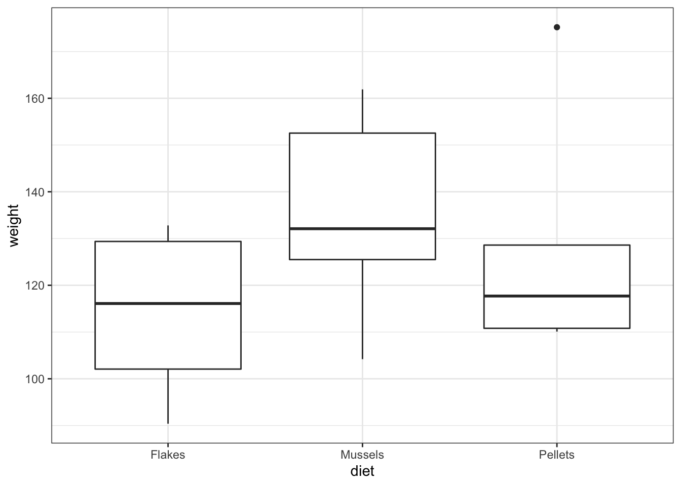
As always we use the plot and summary to assess three things:
- Did we load the data in properly?
- We see three groups with reasonable values. There aren’t any data points that are obviously wrong (negative, zero or massively big) and we have the right number of groups. So it looks as if we didn’t do anything obviously wrong.
- What do we expect as a result of a statistical test?
- Whilst the
Musselsgroup does look higher than the other two groups,PelletsandFlakesappear almost identical in terms of average values, and there’s quite a bit of overlap with theMusselsgroup. A non-significant result is the most likely answer, and I would be surprised to see a significant p-value - especially given the small sample size that we have here.
- What do we think about assumptions?
- The groups appear mainly symmetric (although
Pelletsis a bit weird) and so we’re not immediately massively worried about lack of normality. Again,FlakesandMusselsappear to have very similar variances but it’s a bit hard to decide what’s going on withPellets.It’s hard to say what’s going on with the assumptions and so I’ll wait and see what the other tests say.
12.10.3 Explore Assumptions
Normality
We’ll be really thorough here and consider the normality of each group separately and jointly using the Shapiro-Wilk test, as well as looking at the Q-Q plot. In reality, and after these examples , we’ll only use the Q-Q plot.
First, we perform the Shapiro-Wilk test on the individual groups:
# Shapiro-Wilk on lobster groups
lobsters %>%
  group_by(diet) %>%
  shapiro_test(weight)
## # A tibble: 3 × 4
## diet variable statistic p
## <chr> <chr> <dbl> <dbl>
## 1 Flakes weight 0.844 0.140
## 2 Mussels weight 0.948 0.710
## 3 Pellets weight 0.767 0.0425Flakes and Mussels are fine, but, as we suspected from earlier, Pellets appears to have a marginally significant Normality test result.
Let’s look at the Shapiro-Wilk test for all of the data together:
# create a linear model
lm_lobsters <- lm(weight ~ diet,
                  data = lobsters)

# extract the residuals
resid_lobsters <- residuals(lm_lobsters)

# and perform the Shapiro-Wilk test on the residuals
resid_lobsters %>%
  shapiro_test()
## # A tibble: 1 × 3
## variable statistic p.value
## <chr> <dbl> <dbl>
## 1 . 0.948 0.391This on the other hand says that everything is fine. Let’s look at Q-Q plot.
# Q-Q plots
lm_lobsters %>%
  resid_panel(plots = "qq")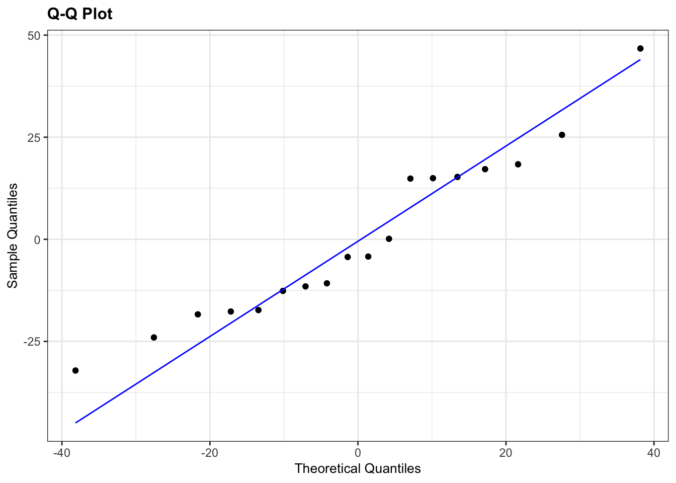
Here, I’ve used an extra argument to the normal diagnostic plots call. The default option is to plot 4 diagnostic plots. You can tell resid_panel() to only plot a specific one, using the plots = arguments. If you want to know more about this have a look at the help documentation or by using ?resid_panel.
The Q-Q plot looks OK, not perfect, but more than good enough for us to have confidence in the normality of the data.
Overall, I’d be happy that the assumption of normality has been adequately well met here. The suggested lack of normality in the Pellets was only just significant and we have to take into account that there are only 5 data points in that group. If there had been a lot more points in that group, or if the Q-Q plot was considerably worse then I wouldn’t be confident.
Equality of Variance
We’ll consider the Bartlett test and we’ll look at some diagnostic plots too.
# perform Bartlett's test
bartlett.test(weight ~ diet,
              data = lobsters)
##
## Bartlett test of homogeneity of variances
##
## data: weight by diet
## Bartlett's K-squared = 0.71273, df = 2, p-value = 0.7002
# plot the residuals and scale-location plots
lm_lobsters %>%
  resid_panel(plots = c("resid", "ls"),
              smoother = TRUE)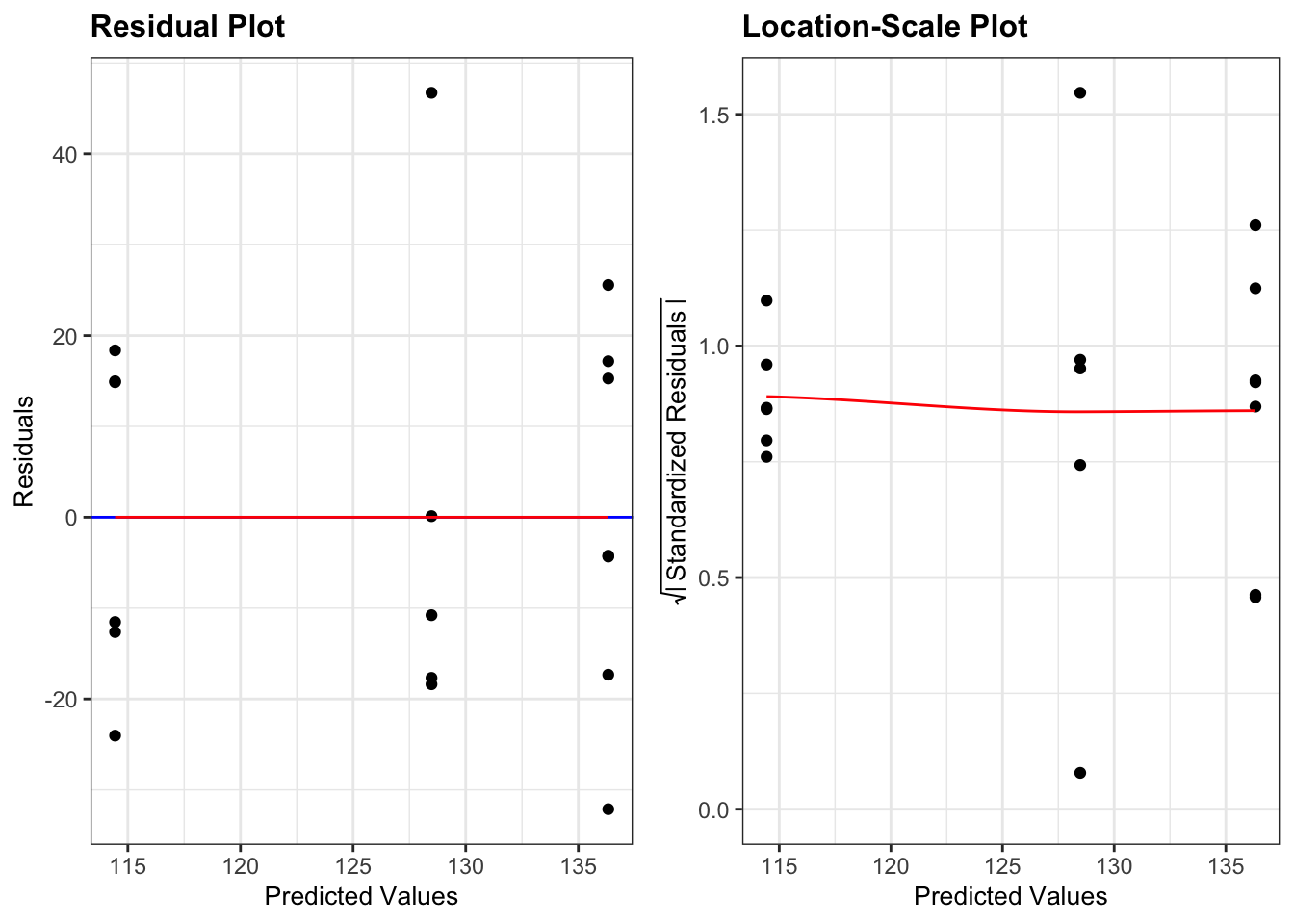
In the above code I’ve specified which diagnostic plots I wanted. I have also added a loess smoother line (smoother = TRUE) to the plots
- The Residuals Plot. What we’re looking for there is that the points are evenly spread on either side of the line. Looks good.
- The Location-Scale Plot (this is displayed by default in base R’s diagnostic plots). Here we’re looking at the red line. If that line is more or less horizontal, then the equality of variance assumption is met.
Here all three methods agree that there isn’t any issues with equality of variance:
- the Bartlett test p-value is large and non-significant
- the spread of points in all three groups in the residuals vs fitted graph are roughly the same
- the red line in the scale-location graph is pretty horizontal
Overall, this assumption is pretty well met.
12.10.4 Carry out one-way ANOVA
With our assumptions of normality and equality of variance met we can be confident that a one-way ANOVA is an appropriate test.
anova(lm_lobsters)## Analysis of Variance Table
##
## Response: weight
## Df Sum Sq Mean Sq F value Pr(>F)
## diet 2 1567.2 783.61 1.6432 0.2263
## Residuals 15 7153.1 476.8712.10.5 Result
A one-way ANOVA test indicated that the mean weight of juvenile lobsters did not differ significantly between diets (F = 1.64, df = 2,15, p = 0.23).
12.10.6 Post-hoc testing with Tukey
## # A tibble: 3 × 9
##   term  group1  group2 null.value estimate conf.low conf.high p.adj p.adj.signif
## * <chr> <chr>   <chr>       <dbl>    <dbl>    <dbl>     <dbl> <dbl> <chr>
## 1 diet  Flakes  Musse…          0    21.9     -9.66      53.5 0.202 ns
## 2 diet  Flakes  Pelle…          0    14.0    -20.3       48.4 0.551 ns
## 3 diet  Mussels Pelle…          0    -7.85   -41.1       25.4 0.815 ns
Here we can see that actually, there is no significant difference between any of the pairs of groups in this dataset.
I want to reiterate that carrying out the post-hoc test after getting a non-significant result with ANOVA is something that you have to think very carefully about and it all depends on what your research question it.
If your research question was:
Does diet affect lobster weight? or Is there any effect of diet on lobster weight?
Then when we got the non-significant result from the ANOVA test we should have just stopped there as we have our answer. Going digging for “significant” results by running more tests is a main factor that contributes towards lack of reproducibility in research.
If on the other hand your research question was:
Are any specific diets better or worse for lobster weight than others?
Then we should probably have just skipped the one-way ANOVA test entirely and just jumped straight in with the Tukey’s range test, but the important point here is that the result of the one-way ANOVA test doesn’t preclude carrying out the Tukey test.
12.11 Key points
- We use an ANOVA to test if there is a difference in means between multiple continuous variables
- In R we first define a linear model with
lm(), using the formatresponse ~ predictor - Next, we perform an ANOVA on the linear model with
anova() - We check assumptions with diagnostic plots and check if the residuals are normally distributed
- We use post-hoc testing to check for significant differences in the group means, for example using Tukey’s range test