8 Paired two-sample t-test
A paired t-test is used when we have two samples of continuous data that can be paired (examples of these sort of data would be weights of individuals before and after a diet). This test is applicable if the number of paired points within the samples is large (>30) or, if the number of points is small, then this test also works when the parent distributions are normally distributed.
8.1 Section commands
| Function | Description |
|---|---|
geom_jitter() |
Plots jittered points by adding a small amount of random variation to each point, to handle overplotting |
pivot_wider() |
“Widens” the data, increasing the number of columns |
8.2 Data and hypotheses
For example, suppose we measure the cortisol levels in 20 adult females (nmol/l) first thing in the morning and again in the evening. We want to test whether the cortisol levels differs between the two measurement times. We will initially form the following null and alternative hypotheses:
- \(H_0\): There is no difference in cortisol level between times (\(\mu M = \mu E\))
- \(H_1\): There is a difference in cortisol levels between times (\(\mu M \neq \mu E\))
We use a two-sample, two-tailed paired t-test to see if we can reject the null hypothesis.
- We use a two-sample test because we now have two samples
- We use a two-tailed t-test because we want to know if our data suggest that the true (population) means are different from one another rather than that one mean is specifically bigger or smaller than the other
- We use a paired test because each data point in the first sample can be linked to another data point in the second sample by a connecting factor
- We’re using a t-test because we’re assuming that the parent populations are normal and have equal variance (We’ll check this in a bit)
The data are stored in a tidy format in the file data/tidy/CS1-twopaired.csv.
Read this into R:
# load the data
cortisol <- read_csv("data/tidy/CS1-twopaired.csv")

# have a look at the data
cortisol
## # A tibble: 40 × 3
## patient_id time cortisol
## <dbl> <chr> <dbl>
## 1 1 morning 311.
## 2 2 morning 146.
## 3 3 morning 297
## 4 4 morning 271.
## 5 5 morning 268.
## 6 6 morning 264.
## 7 7 morning 358.
## 8 8 morning 316.
## 9 9 morning 336.
## 10 10 morning 221.
## # … with 30 more rowsWe can see that the data frame consists of three columns:
-
patient_id, a unique ID for each patient -
timewhen the cortisol level was measured -
cortisol, which contains the measured value.
For each patient_id there are two measurements: one in the morning and one in the afternoon.
8.3 Summarise and visualise
# create a boxplot
cortisol %>%
  ggplot(aes(x = time, y = cortisol)) +
  geom_boxplot() +
  geom_jitter(width = 0.2) +
  ylab("Cortisol level (nmol/l)")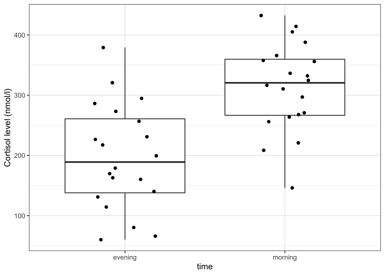
Here we use also visualise the actual data points, to get a sense of how these data are spread out. To avoid overlapping the data points (try using geom_point() instead of geom_jitter()), we jitter the data points. What geom_jitter() does is add a small amount of variation to each point.
However, this plot does not capture how the cortisol level of each individual subject has changed though. We can explore the individual changes between morning and evening by creating a boxplot of the differences between the two times of measurement.
To do this, we need to put our data in a wide format, using pivot_wider().
# calculate the difference between evening and morning values
cortisol_diff <- cortisol %>%
  pivot_wider(names_from = time, values_from = cortisol) %>%
  mutate(cortisol_change = evening - morning)

# plot the data
  ggplot(cortisol_diff, aes(y = cortisol_change)) +
  geom_boxplot() +
  ylab("Change in cortisol (nmol/l)")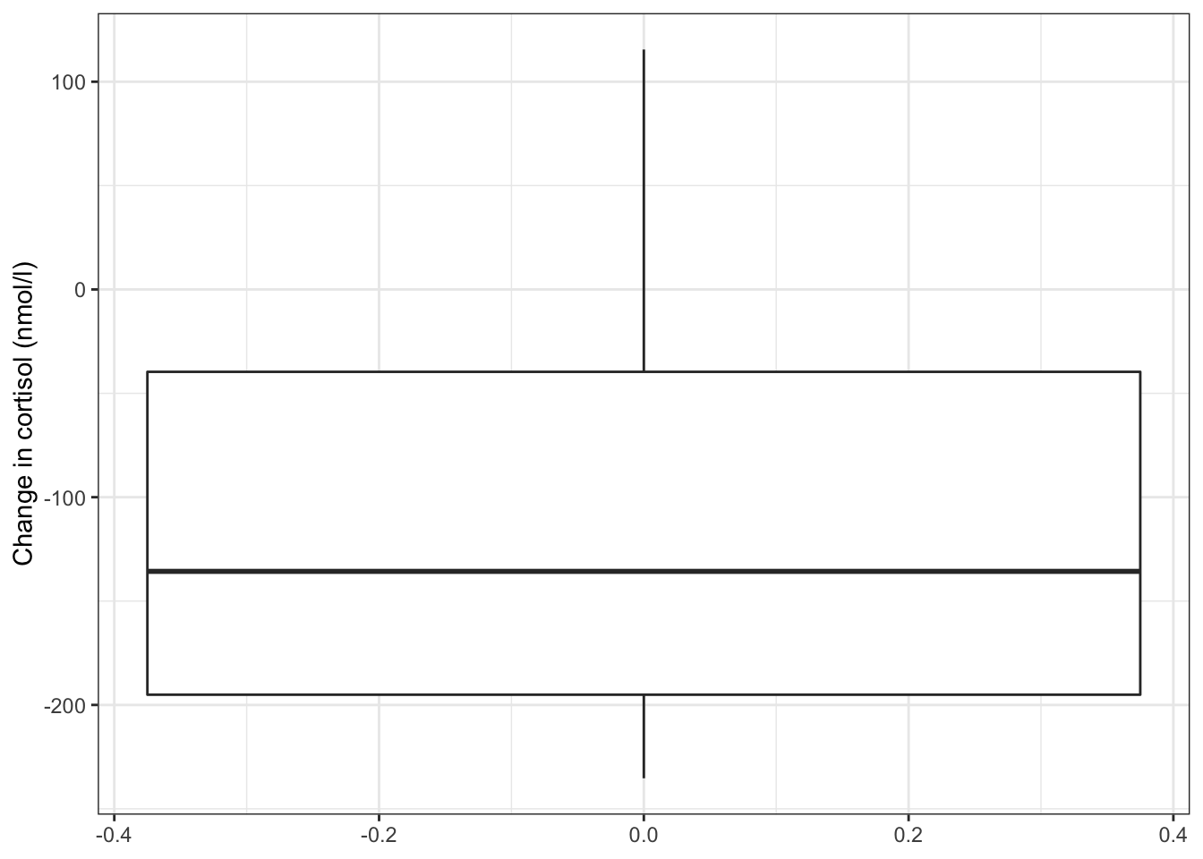
The differences in cortisol levels appear to be very much less than zero, (meaning that the evening cortisol levels appear to be much lower than the morning ones). As such we would expect that the test would give a pretty significant result.
An alternative representation would be to plot the data points for both evening and morning and connect them by patient:
# plot cortisol levels by patient
cortisol %>%
  ggplot(aes(x = time, y = cortisol, group = patient_id)) +
  geom_point() +
  geom_line()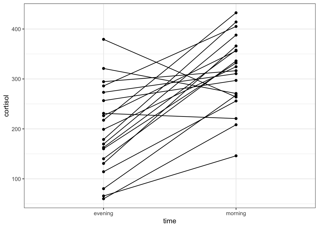
This gives a similar picture to what the boxplot was telling us, that for most patients the cortisol levels are higher in the morning than in the evening.
8.5 Implement test
Perform a two-sample, two-tailed, paired t-test:
- The first argument gives the formula
- The second argument gives the type of alternative hypothesis and must be one of
two.sided,greaterorless - The third argument says that the data are paired
8.6 Interpret output and report results
## # A tibble: 1 × 8
##   .y.      group1  group2     n1    n2 statistic    df         p
## * <chr>    <chr>   <chr>   <int> <int>     <dbl> <dbl>     <dbl>
## 1 cortisol evening morning    20    20     -5.18    19 0.0000529
From our perspective the value of interested is in the p column (p-value = 5.29 \(\cdot\) 10-5). Given that this is substantially less than 0.05 we can reject the null hypothesis and state:
A two-tailed, paired t-test indicated that the cortisol level in adult females differed significantly between the morning (313.5 nmol/l) and the evening (197.4 nmol/l) (t = -5.1, df = 19, p = 5.3 * 10-5).
8.7 Exercise: Assumptions
Exercise 8.1 Checking assumptions
Check the assumptions necessary for this this paired t-test. Was a paired t-test an appropriate test?
Answer
A paired test is really just a one-sample test in disguise. We actually don’t care too much about the distributions of the individual groups. Instead we care about the properties of the differences. So for a paired t-test to be valid for this dataset, we need the differences between the morning and evening values to be normally distributed.
Let’s check this with Shapiro-Wilk and Q-Q plots using the cortisol_diff variable we created earlier.
# perform Shapiro-Wilk test on cortisol differences
cortisol_diff %>%
  shapiro_test(cortisol_change)
## # A tibble: 1 × 3
## variable statistic p
## <chr> <dbl> <dbl>
## 1 cortisol_change 0.924 0.116
# and create the Q-Q plot
lm_cortisol_diff <- lm(cortisol_change ~ 1,
                       data = cortisol_diff)

lm_cortisol_diff %>%
  resid_panel(plots = "qq")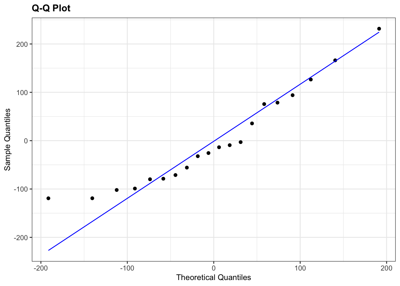
The Shapiro-Wilk test says that the data are normal enough and whilst the Q-Q plot is mostly fine, there is some suggestion of snaking at the bottom left. I’m actually OK with this because the suggestion of snaking is actually only due to a single point (the last point on the left). If you cover that point up with your thumb (or finger of your choice) then the remaining points in the Q-Q plot look pretty good, and so the suggestion of snaking is actually driven by only a single point (which can happen by chance). As such I’m actually happy that the assumption of normality is well met in this case. This single point check is a useful thing to remember when assessing diagnostic plots.
So, yep, a paired t-test is appropriate for this dataset.