Data manipulation and visualisation with tidyverse
Alexia Cardona & Martin van Rongen
Data exploration workflow
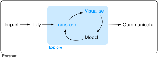
When you are working on a project that requires data analysis, you will normally need to perform the following steps:
 )
)
More information on this workflow can be found in the R for Data Science book. To understand better the workflow in the illustration above, let us go over each stage to see what each step entails:
- The first step in working with data is to first import your data into R. This connects the external file/database to your project in R.
- Cleaning or tidying the data will follow, which involves making sure that the data is consistent and that each row in the dataset is an observation and each column is a variable.
e.g. In the surveys data frame the month column specifies months as an integer from 1 to 12. The dataset would have inconsistent data if there was a record in the dataset that had a month specified by name, e.g. September rather than 9. A month of 0 or any other number that is not in the range 1 to 12 would have also made the dataset inconsistent. Another common problem is capitalisation; the same word in the same column can be written with capitals or without; e.g. Bird or bird in the same taxa column is inconsistent data. During the tidying stage it is important to make the dataset consistent and much as possible so that you can focus on the questions you are trying to solve in your analysis.
- Once the dataset is tidy, we move to the transformation stage. To be able to transform your data you need to plan in advance what analyses you would like to perform on the dataset and what plots you would like to create. In this way, you are able to plan ahead what variables/columns you will be using from the dataset, what additional variables you will need to create and what variables you will not be using so that you can keep only the columns in the dataset that are relevant for your analyses. By the end of the transformation process you will have a dataset that is focused for your analyses and you can move on to the main exploratory mechanisms of this workflow which are visualisation and modelling. These two stages complement each other and when exploring your data you normally repeat these two stages several times.
- Visualising data is a powerful way to explore your data. Furthermore it helps you understand if there is any pattern in the data.
- Modelling the data involves applying statistics or other mathematical or computational models on your data to explore if there are correlations or patterns in the dataset to help you answer the scientific question you are trying to solve.
- The last step in the data exploration workflow is to communicate your results. This is very important as you will need to be able to communicate your results to others to have a successful project.
All these stages in the data exploration workflow can be achieved by programming in R. In this course we will not look into the Model and Communicate stages of the workflow in this course. You will be able to learn more about these in the following courses:
- Model: Statistics for Biologists in R and An Introduction to Machine Learning
- Communicate: Reproducible Research with R
In the next sections we will be looking at the import, tidy, transform and visualise stages of the data exploration workflow by using one of the most popular packages in data science in R; Tidyverse.
Packages
So far we have learnt how to use R with R’s in-built functionality that we will refer to as R Base. There is a way, however, to extend this functionality by using external functions through packages. Packages in R are basically sets of additional functions that let you do more stuff. The functions we’ve been using so far, like str() or head(), come built into R; packages give you access to more of them. Below is an illustration of the concept of a package.
Tidyverse
The package that we will be using in this course is called tidyverse. It is an “umbrella-package” that contains several packages useful for data manipulation and visualisation which work well together such as readr, tidyr, dplyr, ggplot2, tibble, etc…
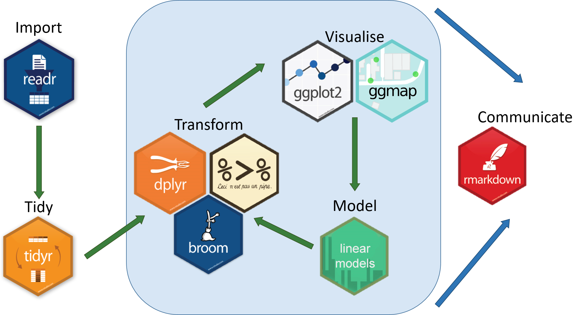
Tidyverse is a recent package (launched in 2016) when compared to R base (stable version in 2000), thus you will still come across R resources that do not use tidyverse. However, since its release, tidyverse has been increasing in popularity throughout the R programming community and it is now very popular in Data Science as it was designed with the aim to help Data Scientists perform their tasks more efficiently.
Some of the main advantages of tidyverse over R base are:
- Easier to read
Bracket subsetting is handy, but it can be cumbersome and difficult to read, especially for complicated operations.
e.g. Get only the rows that have species as albigula surveyed in the year 1977.
# R Base
surveys[surveys$species == "albigula" &
        surveys$year == 1977, ]

# Tidyverse
filter(surveys, species == "albigula", year == 1977)- Faster
Using tidyverse is up to 10x faster1 when compared to the corresponding base R base functions.
- Strings are not converted to
factorWe have seen in our previous lesson that when building or importing a data frame, the columns that contain characters (i.e., text) are coerced (=converted) into the
factordata type. We had to setstringsAsFactorstoFALSEto avoid this hidden argument to convert our data type. With tidyverse, this does not happen.
Installing and loading packages
Before using a package for the first time you will need to install it on your machine, and then you should import it in every subsequent R session when you need it. To install a package in R on your machine you need to use the install.packages function. To install the tidyverse package type the following straight into the console:
# Install the tidyverse package
install.packages("tidyverse")
It is better to install packages straight from the console then from your script as there’s no need to re-install packages every time you run the script.
Then, to load the package type:
# Load the tidyverse package
library(tidyverse)
Importing/Reading data from files

After loading the tidyverse package in R we are now able to use its’ functions. We will start working through the data exploration workflow by first importing data into R. To import the data into R as before, we will now use the read_csv function, from the tidyverse package readr, instead of using read.csv from R base. The readr package contains functions to read tabular data into R. Let us read in the same file we used before using tidyverse this time:
surveys <- read_csv("data_raw/portal_data_joined.csv")Tibble

After importing data into R we need to check if the data has been loaded into R correctly.
# Display the first 6 rows of the dataset
head(surveys)
#> # A tibble: 6 x 13
#> record_id month day year plot_id species_id sex hindfoot_length weight
#> <dbl> <dbl> <dbl> <dbl> <dbl> <chr> <chr> <dbl> <dbl>
#> 1 1 7 16 1977 2 NL M 32 NA
#> 2 72 8 19 1977 2 NL M 31 NA
#> 3 224 9 13 1977 2 NL <NA> NA NA
#> 4 266 10 16 1977 2 NL <NA> NA NA
#> 5 349 11 12 1977 2 NL <NA> NA NA
#> 6 363 11 12 1977 2 NL <NA> NA NA
#> # … with 4 more variables: genus <chr>, species <chr>, taxa <chr>,
#> # plot_type <chr>Notice that the first line of the output shows the data structure used to store the data imported into: tibble. tibble is the main data structure used in tidyverse. You can look at tibble as the data.frame version of tidyverse. The first immediate difference from a data.frame is that a tibble displays the data type of each column under its name and it only prints as many columns as fit on one screen. Furthermore as mentioned before, the columns of class character are never converted into factor. Another difference is that printing a tibble will not print the whole dataset, but just the first 10 rows and only the columns that fit the screen (same as head but with 10 rows instead of 6). If you would like to print more than the first 10 rows use the print function.
# Print the first 15 rows
print(surveys, n = 15)
#> # A tibble: 34,786 x 13
#> record_id month day year plot_id species_id sex hindfoot_length weight
#> <dbl> <dbl> <dbl> <dbl> <dbl> <chr> <chr> <dbl> <dbl>
#> 1 1 7 16 1977 2 NL M 32 NA
#> 2 72 8 19 1977 2 NL M 31 NA
#> 3 224 9 13 1977 2 NL <NA> NA NA
#> 4 266 10 16 1977 2 NL <NA> NA NA
#> 5 349 11 12 1977 2 NL <NA> NA NA
#> 6 363 11 12 1977 2 NL <NA> NA NA
#> 7 435 12 10 1977 2 NL <NA> NA NA
#> 8 506 1 8 1978 2 NL <NA> NA NA
#> 9 588 2 18 1978 2 NL M NA 218
#> 10 661 3 11 1978 2 NL <NA> NA NA
#> 11 748 4 8 1978 2 NL <NA> NA NA
#> 12 845 5 6 1978 2 NL M 32 204
#> 13 990 6 9 1978 2 NL M NA 200
#> 14 1164 8 5 1978 2 NL M 34 199
#> 15 1261 9 4 1978 2 NL M 32 197
#> # … with 3.477e+04 more rows, and 4 more variables: genus <chr>, species <chr>,
#> # taxa <chr>, plot_type <chr>Since printing tibble already gives you information about the data structure, the data types of each column and the size of the dataset, the str function is not as much useful as it was when using data.frame.
# Inspect the data
str(surveys)
#> Classes 'spec_tbl_df', 'tbl_df', 'tbl' and 'data.frame': 34786 obs. of 13 variables:
#> $ record_id : num 1 72 224 266 349 363 435 506 588 661 ...
#> $ month : num 7 8 9 10 11 11 12 1 2 3 ...
#> $ day : num 16 19 13 16 12 12 10 8 18 11 ...
#> $ year : num 1977 1977 1977 1977 1977 ...
#> $ plot_id : num 2 2 2 2 2 2 2 2 2 2 ...
#> $ species_id : chr "NL" "NL" "NL" "NL" ...
#> $ sex : chr "M" "M" NA NA ...
#> $ hindfoot_length: num 32 31 NA NA NA NA NA NA NA NA ...
#> $ weight : num NA NA NA NA NA NA NA NA 218 NA ...
#> $ genus : chr "Neotoma" "Neotoma" "Neotoma" "Neotoma" ...
#> $ species : chr "albigula" "albigula" "albigula" "albigula" ...
#> $ taxa : chr "Rodent" "Rodent" "Rodent" "Rodent" ...
#> $ plot_type : chr "Control" "Control" "Control" "Control" ...
#> - attr(*, "spec")=
#> .. cols(
#> .. record_id = col_double(),
#> .. month = col_double(),
#> .. day = col_double(),
#> .. year = col_double(),
#> .. plot_id = col_double(),
#> .. species_id = col_character(),
#> .. sex = col_character(),
#> .. hindfoot_length = col_double(),
#> .. weight = col_double(),
#> .. genus = col_character(),
#> .. species = col_character(),
#> .. taxa = col_character(),
#> .. plot_type = col_character()
#> .. )Notice that rather than specifing tibble as the data structure of surveys, the first line of str’s output now specifies ‘spec_tbl_df’, ‘tbl_df’, ‘tbl’ and 'data.frame' which can be a bit confusing. These are the classes tibble inherts from which in simple terms means that tibble is a data.frame with a few modifications. Therefore, most of the functions that were used with data.frame can also be used with tibble.
Visualising data in R
After inspecting the surveys dataset in R, the data looks tidy and we are happy with its format, so let us start understanding better our data by visualising it. ggplot2 is the visualisation package in tidyverse and we will be using this to create some plots. ggplot2 is a very popular package used for plotting mainly due to its simple way to create plots from tabular data.
To create a plot, we will use the following basic template.
ggplot(data = <DATA>, mapping = aes(<MAPPINGS>)) + <GEOM_FUNCTION>()As you can see there are 3 main elements that you need to create a plot:
The ggplot function takes 2 arguments:
- data: This is the data frame to attach to the plot. The data frame must contain the variables to plot as columns and the rows must contain the observations that you need to plot.
- mapping: Aesthetic mappings describe how variables in the data are mapped to visual properties of the plot.
Using the ggplot function on its own will not plot anything. We need to add a geom_function as a layer. Layers are added to plots by using +. They are added on top of the other previous layers that might be present.
- geom_function: This specifies the type of plot would you like to plot. The greatest advantage of this is that you can easily change the plot type by just changing the geom_function and keeping everything else the same. You can see a whole list of plots that you can plot here.
Let us practice this on our surveys dataset. We would like to create a scatter plot with weight on the x-axis, hindfoot_length on the y-axis
ggplot(data = surveys, mapping = aes(x = weight, y = hindfoot_length))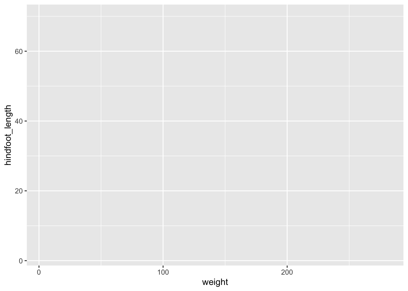
Adding layers
As you can see if you just specify the ggplot function with the data and aesthetic mappings, it will just create an empty plot. Let us now add the geom_function for the scatter plot (geom_point) as a layer to the plot:
ggplot(data = surveys, mapping = aes(x = weight, y = hindfoot_length)) +
  geom_point()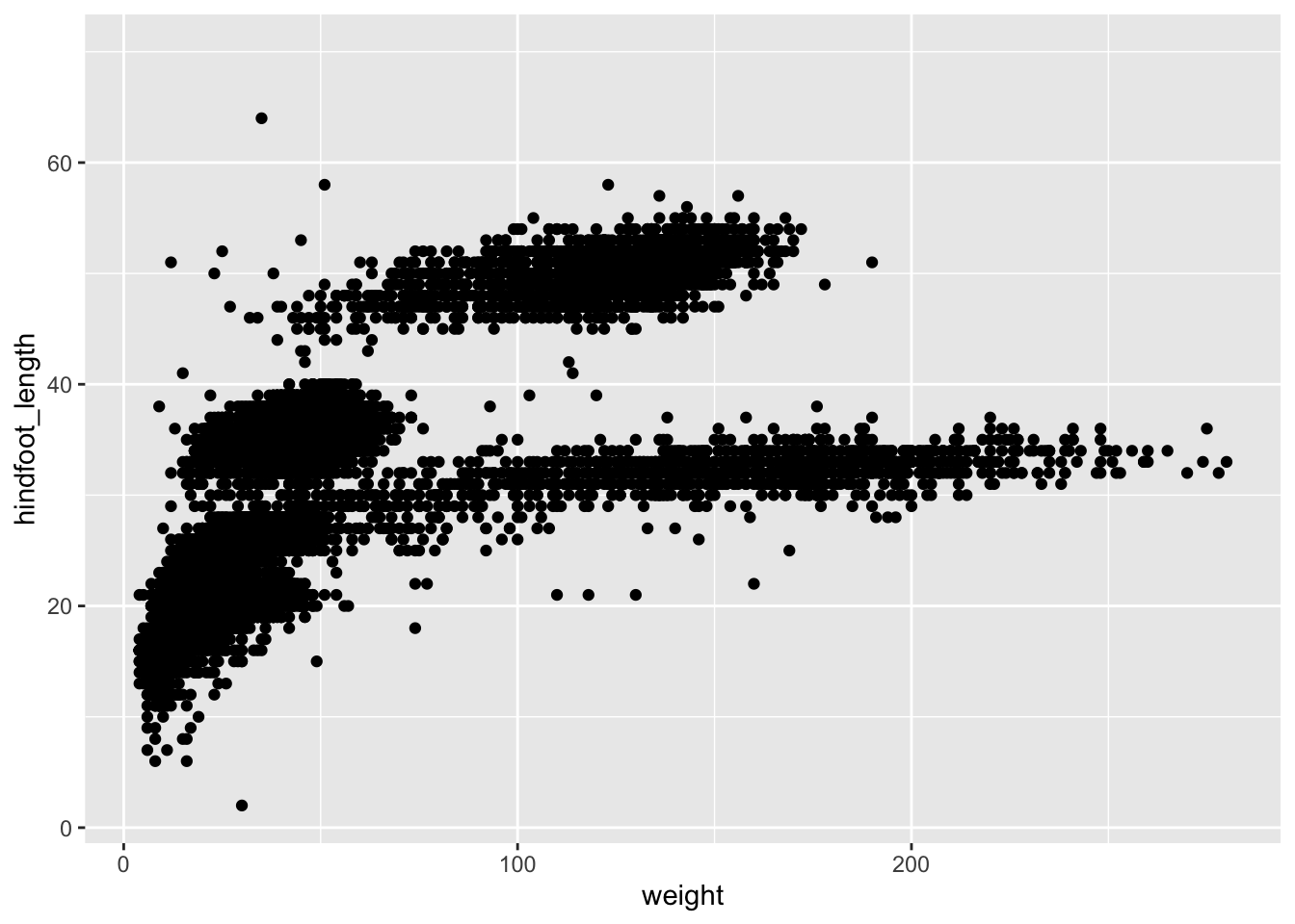
You can customise some of the visualisations of the plot to extract more information from it. For instance, we can add transparency (alpha) to avoid overplotting:
ggplot(data = surveys, mapping = aes(x = weight, y = hindfoot_length)) +
    geom_point(alpha = 0.1)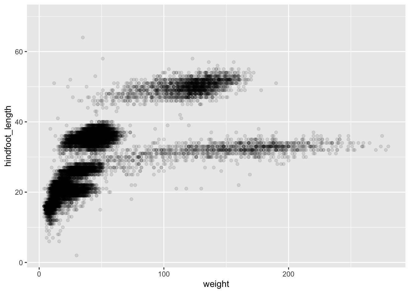
You can find a list of aesthetics for each type of plot in the ggplot2 cheat sheet.
We can also add colours for all the points:
ggplot(data = surveys, mapping = aes(x = weight, y = hindfoot_length)) +
    geom_point(alpha = 0.1, colour = "blue")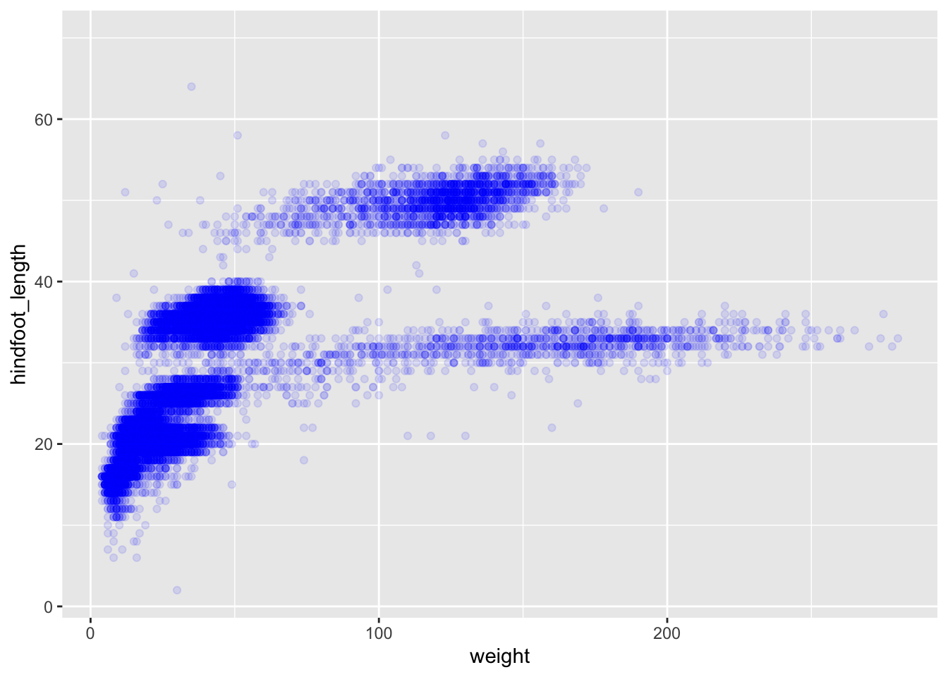
If we would like to try other type of plots on the data, the best thing is to save the ggplot into a variable as below:
# Assign plot to a variable
surveys_plot <- ggplot(data = surveys,
                       mapping = aes(x = weight, y = hindfoot_length))

# Draw a scatter plot
surveys_plot +
    geom_point()
Now draw a geom_smooth plot. This plot is good when you need to see if there is any pattern between the two variables being plotted that you would not normally see in a scatter plot due to overplotting.
surveys_plot +
    geom_smooth()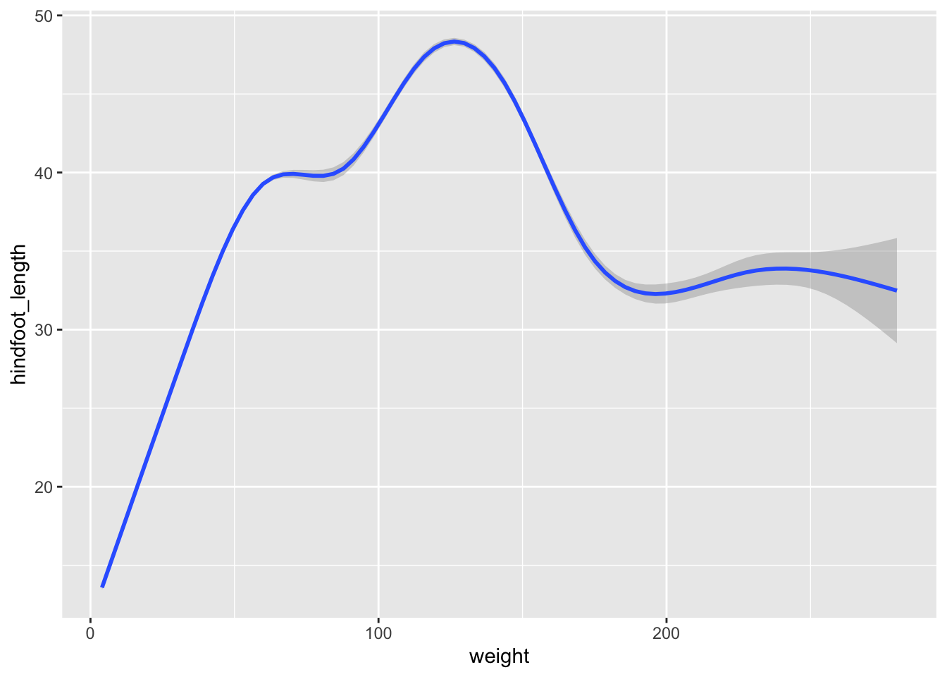
Rather than seeing each plot separately, sometimes plotting multiple plots on top of each other is a better way. You can add multiple plots as layers on top of each other as follows:
surveys_plot +
  geom_point() +
  geom_smooth()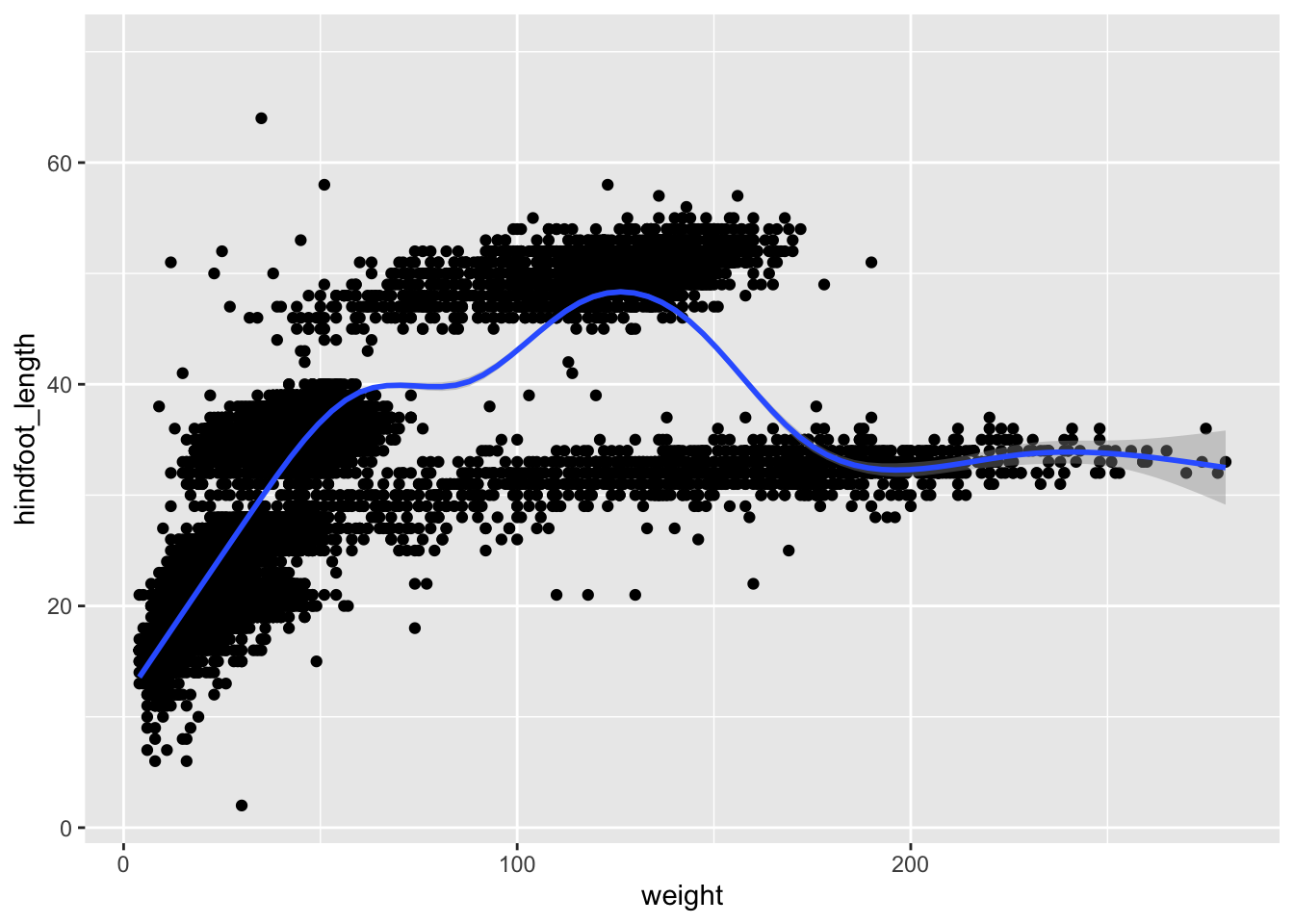
Note
- Anything you put in the
ggplot()function can be seen by any geom layers that you add (i.e., these are universal plot settings).- You can also specify mappings for a given geom independently of the mappings defined globally in the
ggplot()function.- The
+sign used to add new layers must be placed at the end of the line containing the previous layer. If, instead, the+sign is added at the beginning of the line containing the new layer, >ggplot2will not add the new layer and will return an error message.# This is the correct syntax for adding layers surveys_plot + geom_point() # This will not add the new layer and will return an error message surveys_plot + geom_point()
Challenge
Scatter plots can be useful exploratory tools for small datasets. For data sets with large numbers of observations, such as the
surveysdata set, overplotting of points can be a limitation of scatter plots. We have already seen how we can visualise data better when we have overplotting with thegeom_smoothplot. Another way for handling overplotting is to display the density of the data through contours. As this challenge’s task create a script calledplot_density2d.Rwhich loads the file data_raw/portal_data_joined.csv into the variablesurveys. It then uses this dataset to plot theweighton the x-axis andhindfoot_lengthon the y-axis in ageom_density2dplot.Answer
library(tidyverse)

# Load the surveys data
surveys <- read_csv("data_raw/portal_data_joined.csv")

# Attach data and map x and y axes
surveys_plot <- ggplot(data = surveys,
                      mapping = aes(x = weight, y = hindfoot_length))
# Draw geom_density2d
surveys_plot +
geom_density2d()
Saving a plot to a file
To save a plot to file use the ggsave function. If you look at the documentation of ggsave you can see the different arguments the ggsave function takes. Let us save the plot present in the surveys_plot variable into a file called plot_weight_hindfoot_density2d.png into a folder in this project called img_output.
#save plot that you would like to save into a variable
out_plot <- surveys_plot + geom_density2d()
#save plot to file
ggsave(filename="img_output/plot_weight_hindfoot_density2d.png", plot = out_plot)
Note
- You do not need to save the plot into a variable before saving it to file. If you do not specify the
plotargument of theggsavefunction,ggsavewill take the last plot that you plotted and save it into thefilenamespecified.# Save plot to file ggsave(filename = "img_output/plot_weight_hindfoot_density2d.png")
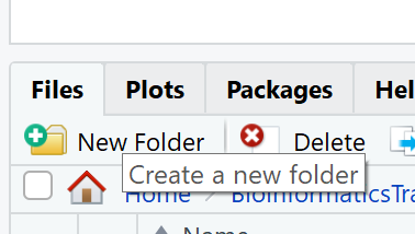
- You can create folders straight from RStudio from the right bottom pane in the Files section > New Folder icon.
Transforming data - dplyr
In most of the cases you will need to change the format of your dataset because it will not be in the right format that you will need to plot or analyse the data. tidyverse has a package called dplyr which contains functions that help you to select columns/rows, sort, combine and perform other data types of data transformations. In the next sections we will look at different ways to transform our dataset. Now that we already know the basics of visualing data with ggplot we will also learn how to visualise other plots with the transformed dataset as we go along.
To learn more about
dplyrplease look at the following resources:If you find these resources difficult to understand, return to these after completing the course.
Selecting columns
To select columns of a data frame or tibble, use theselect function. The first argument is the data frame or tibble you are working on (in our example it is surveys), and the subsequent arguments are the columns to keep.
# Extract species_id, weight, hindfoot_lenth, year and sex columns from surveys dataset.
select(surveys, species_id, weight, hindfoot_length, year, sex)
To select all columns except certain ones, put a - in front of the column to exclude it.
# Select all columns of the surveys dataset apart from record_id and species_id columns.
select(surveys, -record_id, -species_id)
Filtering rows
To remove rows from a data frame or tibble use the filter function from the dplyr package. The first argument is the data frame or tibble to perform the filtering on and the next arguments are the conditions on which to keep the rows.
Filtering rows by values
To choose rows based on a specific condition, use the filter function as follows:
# Keep only the observations of animals collected from 1995 onwards from the surveys dataset.
filter(surveys, year >= 1995)
You can filter on multiple conditions:
# Keep only the observations of animals collected from 1995 onwards
# that are female from the surveys dataset.
filter(surveys, year >= 1995, sex == "F")
Note The sex column is a character and thus needs to be quoted, whereas the year column is numerical and does not.
Remove rows with NA (missing) values
When we were plotting weight against hindfoot_length in the previous section, you must have noticed that we were getting a warning message:
#> Warning: Removed 4048 rows containing missing values (geom_point).This is because some of the values in the weight and hindfoot_length are NA. NA is short for Not Available and essentially it means that there is no data for that particular index in the table. We also refer to this as missing data. ggplot does not plot the observations that have missing data and outputs the warning above which shows the number of observations that have missing data in the dataset we are plotting. We can filter these rows before we plot them so that ggplot will have all the values for the observations it is plotting and so no warning will be disaplyed.
The is.na function returns TRUE if the value passed to it is NA. Applied to a vector or data frame it will return TRUE or FALSE for each index in the vector or data frame depending on whether the value at each index is missing or not. The ! symbol negates the result, so !is.na can be interpreted as is not NA. See how this can be used in the code below:
# Which values of the weight column are missing?
is.na(surveys$weight)

# Which values of the weight column are not missing?
!is.na(surveys$weight)
Now let us apply the is.na function in dplyr’s filter function to remove the rows that have weight or hindfoot_length as NA from the surveys tibble. Here it’s good to start breaking up the code over multiple lines to improve readability.
filter(surveys,
  !is.na(weight), # remove rows that have weight as NA
  !is.na(hindfoot_length))  # remove rows that have hindfoot_length as NA
Another way to remove rows that have NA values is by using the drop_na function in the tidyr package. The code above can be replaced by the following code which gives the same answer:
drop_na(surveys, weight, hindfoot_length)Using drop_na() without specifying any columns will remove all the rows that have NA in any of the columns.
drop_na(surveys)Let us save the results of this in surveys_complete variable which contains only the rows that have all the values in all the columns present and use this for the remaining of the course.
surveys_complete <- drop_na(surveys)Pipes
What if you want to select and filter at the same time? There are three ways to do this:
- use intermediate steps
- nested functions
- pipes
With intermediate steps, you create a temporary data frame and use that as input to the next function, like this:
surveys2 <- select(surveys_complete, species_id, weight, hindfoot_length, year, sex)
surveys_recent <- filter(surveys2, year >= 1995)
This is readable, but can clutter up your workspace with lots of objects that you have to name individually. With multiple steps, that can be hard to keep track of.
You can also nest functions (i.e., one function inside of another), like this:
surveys_recent <- filter(
                    select(surveys_complete,
                           species_id, weight, hindfoot_length, year, sex)
                    , year >= 1995)
This is handy, but can be difficult to read if too many functions are nested, as R evaluates the expression from the inside out (in this case, selecting, then filtering).
The last option, pipes, are a recent addition to R. Pipes let you take the output of one function and send it directly to the next, which is useful when you need to do many things to the same dataset. Pipes in R look like %>% and are made available via the magrittr package, installed automatically with dplyr.
surveys_complete %>%
  select(species_id, weight, hindfoot_length, year, sex) %>%
  filter(year >= 1995)
In the above code, we use the pipe to send the surveys_complete dataset first through select and then through filter. Some may find it helpful to read the pipe like the word “then”. For instance, in the above example, we took the tibble surveys_complete, then we selected columns species_id, weight, hindfoot_length, yearand sex. We then filtered the rows and only kept the ones that have year >= 1995.
Since %>% takes the object on its left and passes it as the first argument to the function on its right, we don’t need to explicitly include the data frame/tibble as an argument to the select and filter functions any more. This is one of the biggest advantages of using pipes as it allows us to perform all the operations that we need to do with the need to create useless variables and store useless data. Furthermore, the code is more readable when using pipes. The dplyr functions by themselves are somewhat simple, but by combining them into linear workflows with the pipe, we can accomplish more complex manipulations of data frames/tibbles.
If we want to create a new object with the transformed data we can assign it a new name as below:
surveys_recent <- surveys_complete %>%
                  select(species_id, weight, hindfoot_length, year, sex) %>%
                  filter(year >= 1995)

surveys_recent
Challenge 1 - pipes
Subset the
surveys_completedata to keep only thespecies_id,weight,hindfoot_length,yearandsexcolumns and the animals collected on and after 1995. Then plot a scatter plot ofweight(x-axis) againsthindfoot_length(y-axis) using this transformed dataset. Do all the above using pipes, without creating any variables.Answer
surveys_complete %>%
 # Select columns
 select(species_id, weight, hindfoot_length, year, sex) %>%
 # Filter rows
 filter(year >= 1995) %>%
 # Plot transformed data
 ggplot(mapping = aes(x = weight, y = hindfoot_length)) +
   geom_point()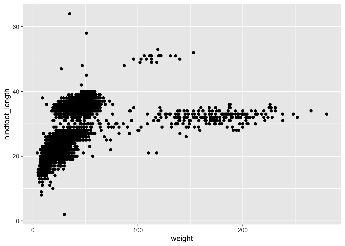
Challenge 2 - plotting subset with different colour
Plot all the animals in the
surveys_completedataset asweight(x-axis) againsthindfoot_length(y-axis). Use the dataset created above which contains only the animals that were collected on and after 1995 and highlight these points in red in the plot.Answer
survey_recent <- surveys_complete %>%
                 select(species_id, weight, hindfoot_length, year, sex) %>%
                 filter(year >= 1995)
ggplot(mapping = aes(x = weight, y = hindfoot_length)) +
 geom_point(data = surveys_complete) +
 geom_point(data = survey_recent, colour = "red")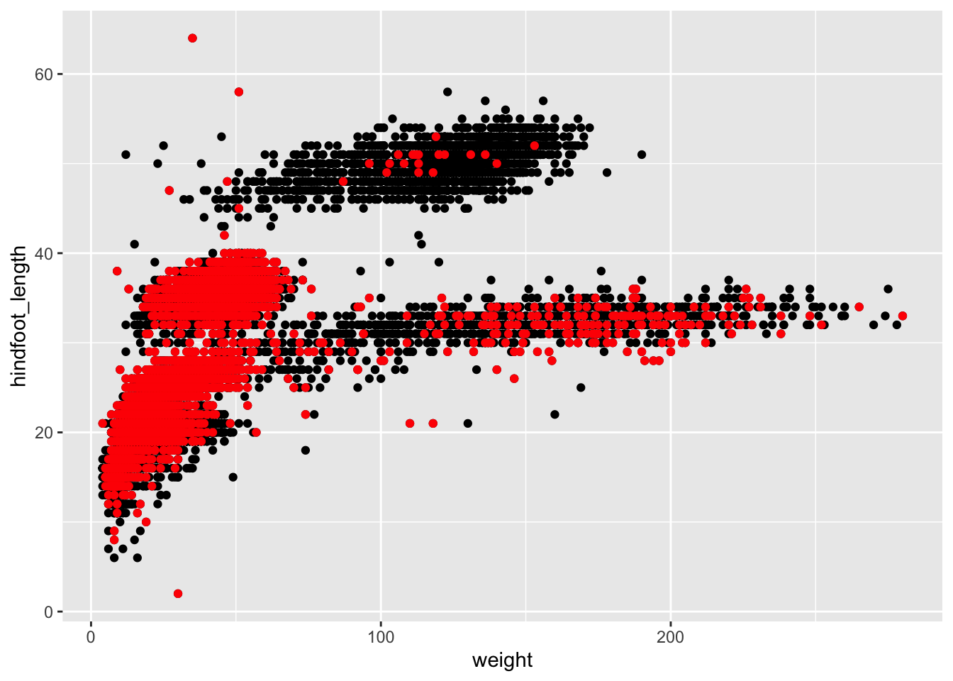
Note: In the example above we did not specify the
dataargument in theggplotfunction because the arguments in theggplotfunction should be common throughout the whole plot. In this case we specified the respective data as separate layers in 2 differentgeom_pointplots; the first plot is the data with all the animals insurveys_complete(points in black), the second plot is layered on top of the first plot which is a subset of thesurveys_completedataset (points in red).
Creating new columns
Frequently you’ll want to create new columns based on the values in existing columns, for example to do unit conversions, or to find the ratio of values in two columns. For this we’ll use the mutate function.
To create a new column of weight in kg:
surveys_complete %>%
  mutate(weight_kg = weight / 1000)
You can also create a second new column based on the first new column within the same call of mutate():
surveys_complete %>%
  mutate(weight_kg = weight / 1000,
         weight_kg2 = weight_kg * 2)
There are other ways on how to create new columns. Refer to the dplyr cheat sheet Make New Variables section.
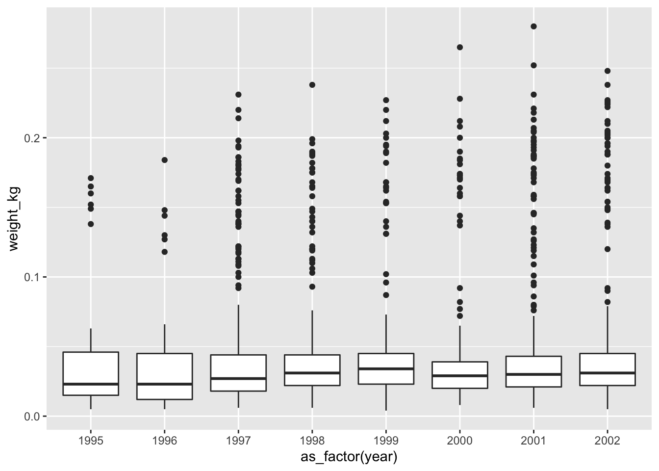
Challenge - the boxplot
Using the
surveys_completedataset, create a boxplot for each year on the x-axis and weight in kg on the y-axis. Use the subset dataset that was transformed in the previous challenge, i.e. the one that has the recent observations (from 1995 onwards). As before try to do all the operations using pipes, without creating variables.
Hint: You will need to use theas_factorfunction to convert theyearcolumn tofactortype.Your first attempt would be to use the code we used before to subset the
surveys_completedataset, but also adding themutatefunction to add a newweight_kgcolumn. Further more you will need to also add theggplotfunction to draw a boxplot:Answer
surveys_complete %>%
 # Add weight_kg column
 mutate(weight_kg = weight / 1000) %>%
 # Select columns
 select(species_id, weight_kg, hindfoot_length, year, sex) %>%
 # Filter rows
 filter(year >= 1995) %>%
 # Plot transformed data
 ggplot(mapping = aes(x = year, y = weight_kg)) +
   geom_boxplot()
#> Warning: Continuous x aesthetic -- did you forget aes(group=...)?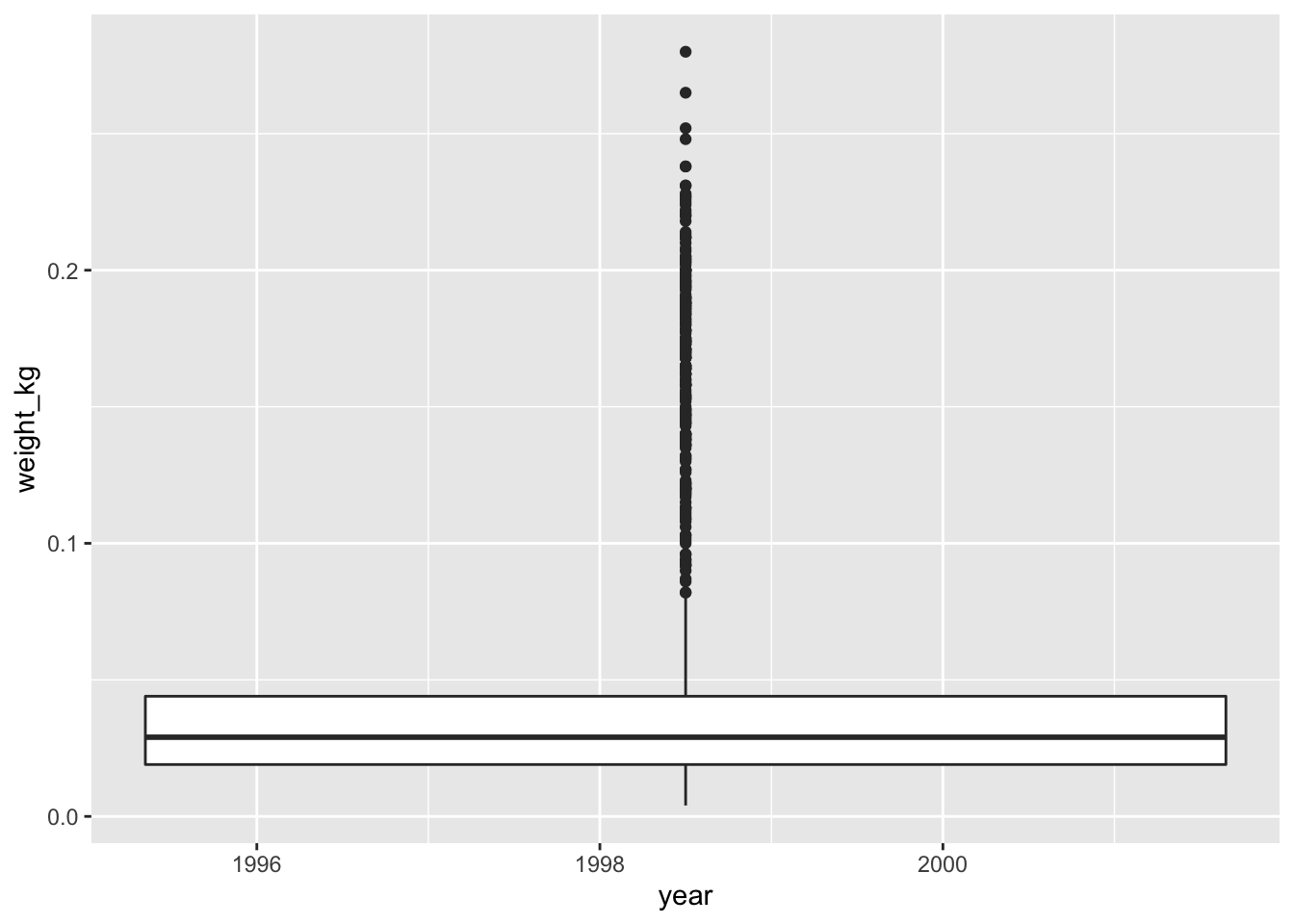
You might notice that this code produces a warning message about the continuous data type of the x-axis and also creates a box plot with one single box and whisker averaged over all the years on the x-axis, rather than one for each year in the dataset as requested. As shown in the
ggplot2cheat sheet, box plots display a discrete variable on the x-axis and a continuous variable on the y-axis. At the momentyearis treated as a continuous variable since its data type isdouble(you can see this from the tibble). To fix this, we need to convert the data type of theyearcolumn to a categorical one (factor) so that each year can be plotted as a separate box and whisker.The
forcatspackage that is part oftidyversehas theas_factorfunction which does just that; it converts a variable into a factor. See the updated code below, which uses theas_factorfunction:Answer
surveys_complete %>%
 # Add weight_kg column
 mutate(weight_kg = weight / 1000) %>%
 # Select columns
 select(species_id, weight_kg, hindfoot_length, year, sex) %>%
 # Filter rows
 filter(year >= 1995) %>%
 # Convert the year column to a factor
 mutate(year = as_factor(year)) %>%
 # Plot transformed data
 ggplot(mapping = aes(x = year, y = weight_kg)) +
   geom_boxplot()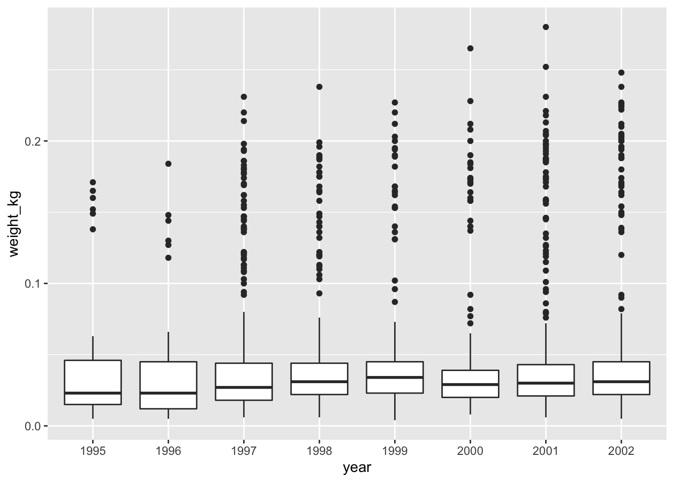
Notice that since we need to keep only observations that have been observed from 1995 onwards, we need to convert the
yearcolumn to afactorafter we filter the rows, as otherwise the row filtering operation will not be possible. This is because the newyearcolumn of typefactordoes not have any ordering in its categories so perfomingyear >= 1995would not be possible.It is also possible to convert the
yearvariable directly from withinggplot, thereby skipping themutatestep from above. We can do this using the updated code below (output is the same as above):surveys_complete %>% # Add weight_kg column mutate(weight_kg = weight / 1000) %>% # Select columns select(species_id, weight_kg, hindfoot_length, year, sex) %>% # Filter rows filter(year >= 1995) %>% # Convert the year variable and plot transformed data ggplot(mapping = aes(x = as_factor(year), y = weight_kg)) + geom_boxplot()
Note on the boxplot
As mentioned the boxplot is used to visualise the distribution of a continuous variable. In the example above we displayed the distribution of
weightover the different years. The figure below illustrates the different components of the boxplot. The bottom line of the box represents the 25th quantile, middle line the 50th quantile (or median) and the top line of the box is the 75th quantile. The whiskers can be thought of as defining the boundary of the confidence intervals of the distribution. The dots outside these whiskers are the outliers.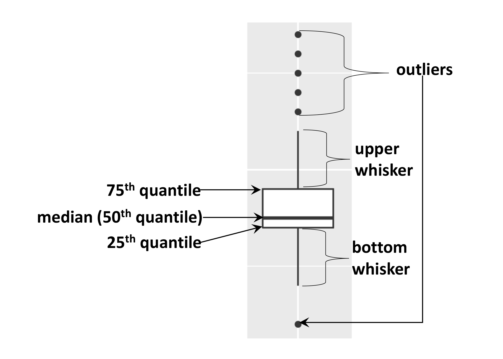
Sorting data
To sort your data dplyr provides function arrange.
# Sort weight in ascending order (default)
surveys_complete %>%
  arrange(weight)
To sort your data in descending order you will need to use desc().
# Sort weight in descending order
surveys_complete %>%
  arrange(desc(weight))
You can sort your dataset based on the values of multiple columns:
# Sort weight in ascending order and hindfoot_length in descending order
surveys_complete %>%
  arrange(weight, desc(hindfoot_length))
As you can see from the result returned, the animals with the smallest weight are at the top. When there is a tie, i.e., more than one animal has the same weight, the animals are sorted in descending order of hindfoot_length. As you can see, the subset of animals with weight of 4 have been sorted in descending order based on hindfoot_length.
Summarising data
Creating summaries of your data would be a good way to start describing the variable you are working with. Summary statistics are a good example of how one can summarise data. We will not cover details about summary statistics in this course, but we will look at how we can summarise data in R.
Frequency - count
The most straightforward summary data is counting the the number of observations or frequencies. Frequencies are normally calculated when working with discrete variables that have a finite number of values, such as categorical data. In our surveys_complete dataset, let us obtain the frequecies of male and female animals present. We can do this by counting the number of “M” and “F” present in the dataset. To do this use the dplyr function count as follows:
  surveys_complete %>%
    count(sex)
#> # A tibble: 2 x 2
#> sex n
#> <chr> <int>
#> 1 F 14584
#> 2 M 16092As you can see count has grouped the categories present in the sex column and returned the frequency of each category. If we wanted to count combination of factors, such as sex and species, we would specify the first and the second factor as the arguments of count():
surveys_complete %>%
  count(sex, species)
#> # A tibble: 41 x 3
#> sex species n
#> <chr> <chr> <int>
#> 1 F albigula 606
#> 2 F baileyi 1617
#> 3 F eremicus 539
#> 4 F flavus 711
#> 5 F fulvescens 55
#> 6 F fulviventer 15
#> 7 F hispidus 91
#> 8 F leucogaster 436
#> 9 F leucopus 16
#> 10 F maniculatus 354
#> # … with 31 more rowsChallenge
- How many animals were observed in each
plot_typesurveyed?Answer
surveys_complete %>%
    count(plot_type)
- What is the frequency of each species of each sex observed? Sort each species in descending order of freqency.
Answer
surveys_complete %>%
 count(sex, species) %>%
 arrange(species, desc(n))
Plotting time series data - geom_line()
Now that we know how to obtain frequencies, let us create a time series plot with ggplot. A time series plot displays values over time with the aim to show how data changes over time. Let us plot years on the x-axis and the frequencies of the yearly observations per genus on the y-axis.
First we need to get the frequencies of the yearly observations per genus:
yearly_counts <- surveys_complete %>%
  count(year, genus)
yearly_counts now contains the following results:
#> # A tibble: 199 x 3
#>     year genus               n
#>    <dbl> <chr>           <int>
#>  1  1977 Chaetodipus         3
#>  2  1977 Dipodomys         222
#>  3  1977 Onychomys           3
#>  4  1977 Perognathus        22
#>  5  1977 Peromyscus          2
#>  6  1977 Reithrodontomys     2
#>  7  1978 Chaetodipus        23
#>  8  1978 Dipodomys         629
#>  9  1978 Neotoma            23
#> 10  1978 Onychomys          80
#> # … with 189 more rows
Let us plot this in a line plot:
ggplot(data = yearly_counts, mapping = aes(x = year, y = n)) +
     geom_line()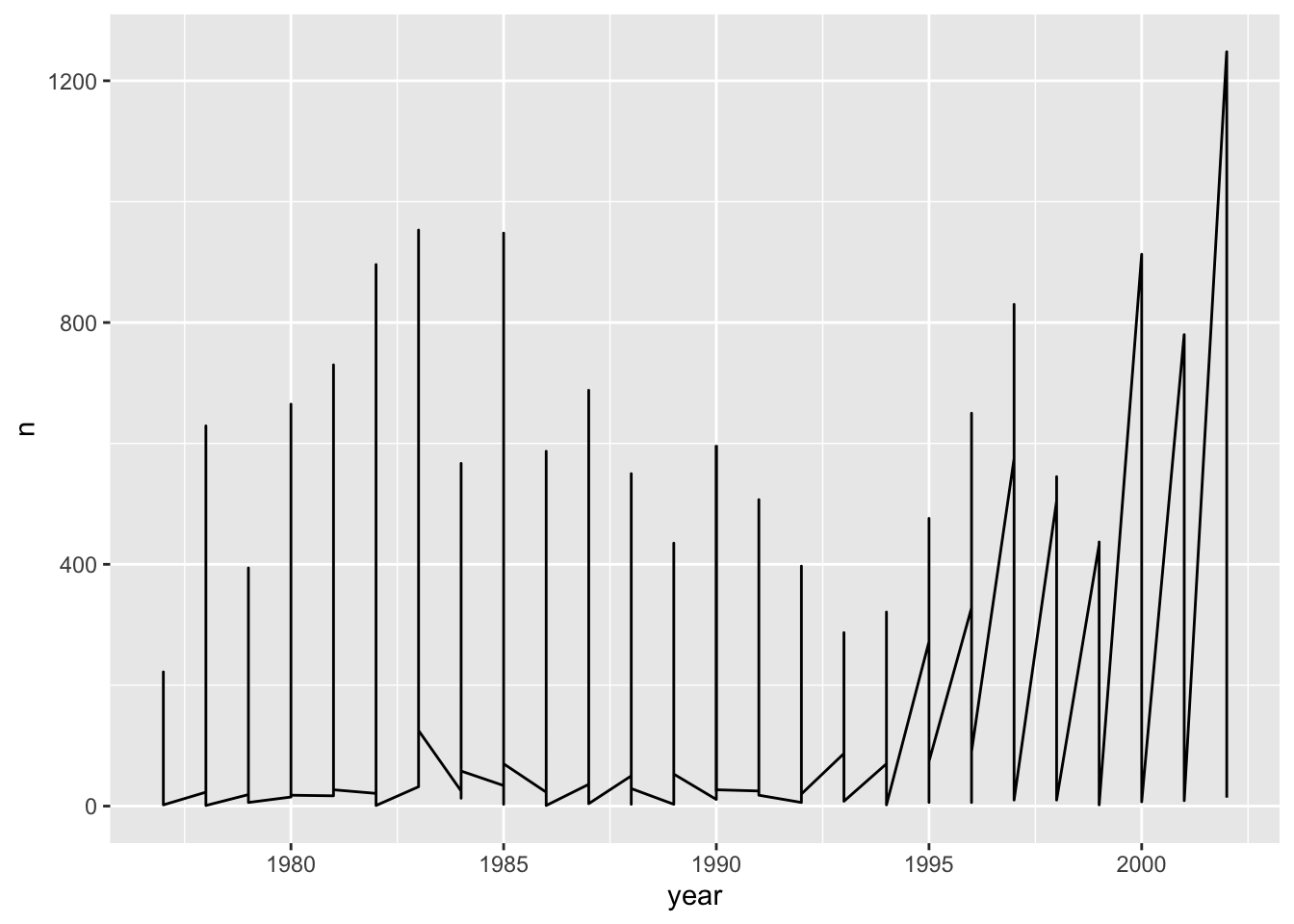
Unfortunately, this does not work because ggplot plotted data for all the genera together. We need to tell ggplot to draw a line for each genus by telling it that each genus forms a group. To do this we have to modify the aesthetic function to include group = genus:
ggplot(data = yearly_counts, mapping = aes(x = year, y = n, group = genus)) +
    geom_line()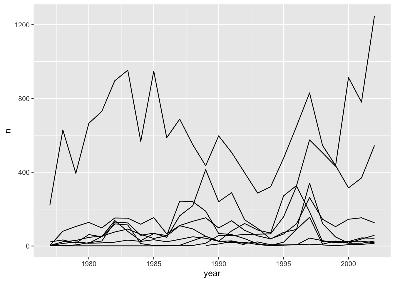
This creates a line for each genus. However, since they are all in the same colour we are not able to distinguish which genus is which. If we use a different colour for each genus the plot should be clear. This is done by using the argument colour in the aesthetic function (using colour also automatically groups the data):
ggplot(data = yearly_counts, mapping = aes(x = year, y = n, colour = genus)) +
    geom_line()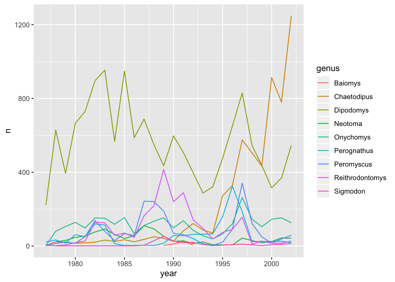
Plotting histograms
If you would like to plot the distribution of a single continuous variable the frequency will be automatically calculated, so you do not need to use count() to calculate the frequency beforehand. The x-axis is automatically divided into bins and the number of observations of the continuous variable in each bin is shown as a bar in the histogram. In the ggplot2 package a histogram can be plotted using the geom_histogram function.
Let us plot a histogram for the continuous variable weight:
ggplot(surveys_complete, aes(weight)) +
  geom_histogram()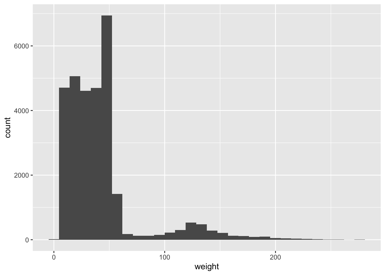
You can identify display categories in the histogram by plotting a stacked histogram which will show categories for each group stacked on top of each other. This is done by using the fill argument in the aesthetic function. If we want to display sex in our weight histogram:
ggplot(surveys_complete, aes(weight, fill = sex)) +
  geom_histogram(bins = 100)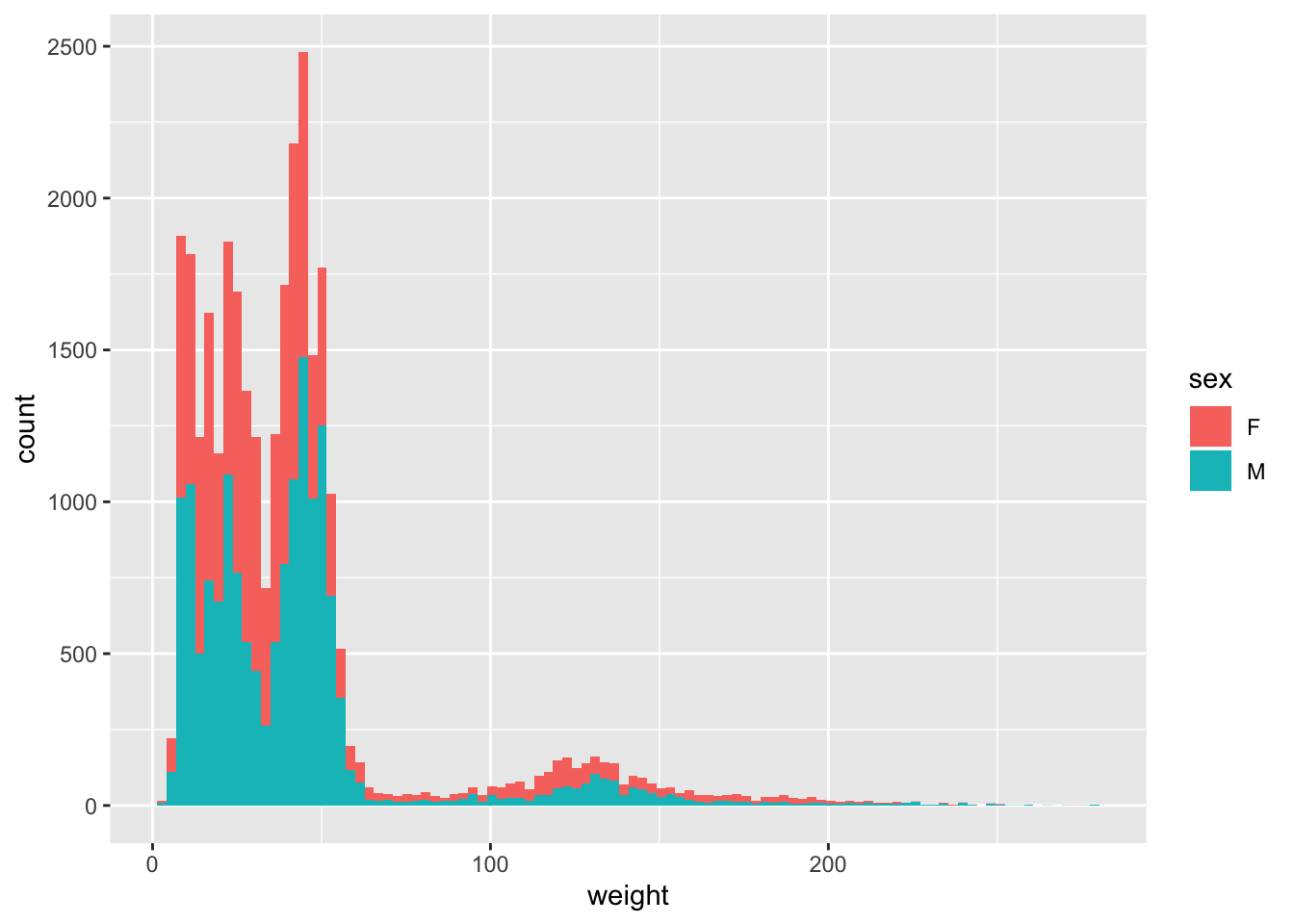
Note that the default number of bins in a histogram is 30. To get have a granular display you can increase the number of bins by using the argument bins in the geom_histogram function as above.
There are other plots that can be used for a single continuous variable (see ONE VARIABLE continuous section on ggplot2 cheat sheet).
Challenge -
geom_freqpoly()Use the
geom_freqpoly()to display frequency polygons instead of bars for the distribution ofweight. Showsexcategory as before in a different colour.
Hint: Use the argumentcolourin the aesthetic function rather thanfillto display a frequency polygon for eachsexcategory in a different colour.Answer
ggplot(surveys_complete, aes(weight, colour = sex)) +
 geom_freqpoly()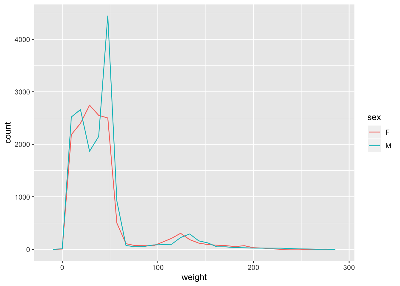
Summarising data with summarise()
When working with continuous variables, one of the most popular summary statistic is the mean. If we try to caclulate the mean on weight in the surveys_complete dataset we get an error:
surveys_complete %>%
  mean_weight = mean(weight)
#> Error in mean(weight): object 'weight' not foundThis is because in dplyr you will need to use the summarise function to be able to create summaries of your data.
The summarise function is used when you want to reduce multiple values in your columns to a single value. If we try to calculate the mean using summarise() this time:
surveys_complete %>%
  summarise(mean_weight = mean(weight))
#> # A tibble: 1 x 1
#> mean_weight
#> <dbl>
#> 1 41.8As seen from the result, the mean of the values present in the weight column is 41.8. This value is the mean of weight of the entire data set. We already know that there are many different groups within the data set, so this is not very informative. It would therefore be good to calculate mean values for groups within the data. We cover how to do this next.
Grouping data
In the examples above we learnt how to summarise data over all observations, e.g., we calculated the mean over all observations using the summarise function. However, in data analysis, especially when dealing with big data, a common approach to data exploration is the split-apply-combine strategy. The idea behind this strategy is to split the data into more managable pieces, apply any operations required on the data independently on each piece and then combine the results together. The figure below illustrates the approach that is done in the split-apply-combine approach.
Let us work on an example on how we can apply the split-apply-combine strategy on the surveys_complete dataset. We would like to split the data by the different categories present in the sex column and calculate the mean weight for each category. We can do this as follows:
surveys_complete %>%
  # Extract females
  filter(sex == "F") %>%
  summarise(mean_weight = mean(weight))
#> # A tibble: 1 x 1
#> mean_weight
#> <dbl>
#> 1 41.5surveys_complete %>%
# Extract males
filter(sex == "M") %>%
summarise(mean_weight = mean(weight))#> # A tibble: 1 x 1
#> mean_weight
#> <dbl>
#> 1 42.1However, this would be a very tedious process to do if we had several categories. We can do this easily by using the group_by function in the dplyr package:
surveys_complete %>%
  group_by(sex) %>%
  summarise(mean_weight = mean(weight))
#> # A tibble: 2 x 2
#> sex mean_weight
#> <chr> <dbl>
#> 1 F 41.5
#> 2 M 42.1You can also group by multiple columns:
surveys_complete %>%
  group_by(sex, species_id) %>%
  summarise(mean_weight = mean(weight))
#> # A tibble: 46 x 3
#> # Groups: sex [2]
#> sex species_id mean_weight
#> <chr> <chr> <dbl>
#> 1 F BA 9.16
#> 2 F DM 41.6
#> 3 F DO 48.5
#> 4 F DS 117.
#> 5 F NL 154.
#> 6 F OL 30.8
#> 7 F OT 24.8
#> 8 F OX 22
#> 9 F PB 30.2
#> 10 F PE 22.8
#> # … with 36 more rowsOnce the data are grouped, you can also summarise multiple variables at the same time (and not necessarily on the same variable). For instance, we could add a column indicating the minimum weight for each species for each sex:
surveys_complete %>%
  group_by(sex, species_id) %>%
  summarise(mean_weight = mean(weight),
            min_weight = min(weight))
#> # A tibble: 46 x 4
#> # Groups: sex [2]
#> sex species_id mean_weight min_weight
#> <chr> <chr> <dbl> <dbl>
#> 1 F BA 9.16 6
#> 2 F DM 41.6 10
#> 3 F DO 48.5 12
#> 4 F DS 117. 45
#> 5 F NL 154. 32
#> 6 F OL 30.8 10
#> 7 F OT 24.8 5
#> 8 F OX 22 22
#> 9 F PB 30.2 12
#> 10 F PE 22.8 11
#> # … with 36 more rowsChallenge
- Use
group_by()andsummarise()to find the mean, min, and max hindfoot length for each species (usingspecies_id). Also add the number of observations in a column calledn_obs(hint: see?n).Answer
surveys_complete %>%
    group_by(species_id) %>%
    summarise(
        mean_hindfoot_length = mean(hindfoot_length),
        min_hindfoot_length = min(hindfoot_length),
        max_hindfoot_length = max(hindfoot_length),
        n_obs = n()
    )
#> # A tibble: 24 x 5 #> species_id mean_hindfoot_length min_hindfoot_length max_hindfoot_length n_obs #> <chr> <dbl> <dbl> <dbl> <int> #> 1 BA 13 6 16 45 #> 2 DM 36.0 16 50 9727 #> 3 DO 35.6 26 64 2790 #> 4 DS 50.0 39 58 2023 #> 5 NL 32.2 21 42 1045 #> 6 OL 20.5 12 39 905 #> 7 OT 20.3 13 50 2081 #> 8 OX 20.4 19 21 5 #> 9 PB 26.1 2 47 2803 #> 10 PE 20.2 11 30 1198 #> # … with 14 more rows
- What was the heaviest animal measured in each year? Return the columns
year,genus,species, andweight.Answer
surveys_complete %>%
    group_by(year) %>%
    filter(weight == max(weight)) %>%
    select(year, genus, species_id, weight) %>%
    arrange(year)
#> # A tibble: 28 x 4 #> # Groups: year [26] #> year genus species_id weight #> <dbl> <chr> <chr> <dbl> #> 1 1977 Dipodomys DS 149 #> 2 1978 Neotoma NL 232 #> 3 1978 Neotoma NL 232 #> 4 1979 Neotoma NL 274 #> 5 1980 Neotoma NL 241 #> 6 1980 Neotoma NL 241 #> 7 1981 Neotoma NL 251 #> 8 1982 Neotoma NL 252 #> 9 1983 Neotoma NL 256 #> 10 1984 Neotoma NL 259 #> # … with 18 more rows
Reshaping data - pivot
In the data exploration workflow we discussed how to structure our data leading to the four rules defining a tidy dataset:
- Each variable has its own column
- Each observation has its own row
- Each value must have its own cell
- Each type of observational unit forms a table
Here we examine the fourth rule: Each type of observational unit forms a table.
In surveys , the rows of surveys contain the values of variables associated with each record (the unit), values such as the weight or sex of each animal associated with each record. What if instead of comparing records, we wanted to compare the different mean weight of each genus between plots? (Ignoring plot_type for simplicity).
We’d need to create a new table where each row (the unit) is comprised of values of variables associated with each plot. In practical terms this means the values in genus would become the names of column variables and the cells would contain the values of the mean weight observed on each plot.
Having created a new table, it is therefore straightforward to explore the relationship between the weight of different genera within, and between, the plots. The key point here is that we are still following a tidy data structure, but we have reshaped the data according to the observations of interest: average genus weight per plot instead of recordings per date.
The opposite transformation would be to transform column names into values of a variable.
We can do both these of transformations with two tidyr functions, pivot_wider() and pivot_longer().
Widening data with pivot_wider()
pivot_wider() takes three principal arguments:
- the
data - the
names_fromcolumn variable whose values will become new column names.
- the
values_fromcolumn variable whose values will fill the new column variables.
Further arguments include values_fill which, if set, fills in missing values with the value provided.
Let’s use pivot_wider() to transform surveys to find the mean weight of each genus in each plot over the entire survey period. We use filter(), group_by() and summarise() to filter our observations and variables of interest, and create a new variable for the mean_weight. We use the pipe as before too.
surveys_gw <- surveys %>%
  filter(!is.na(weight)) %>%
  group_by(plot_id, genus) %>%
  summarise(mean_weight = mean(weight))
str(surveys_gw)
This yields surveys_gw where the observations for each plot are spread across multiple rows, 196 observations of 3 variables. Using pivot_wider() to key on genus with values from mean_weight this becomes 24 observations of 11 variables, one row for each plot. We again use pipes:
surveys_wider <- surveys_gw %>%
  pivot_wider(names_from = genus, values_from = mean_weight)
str(surveys_wider)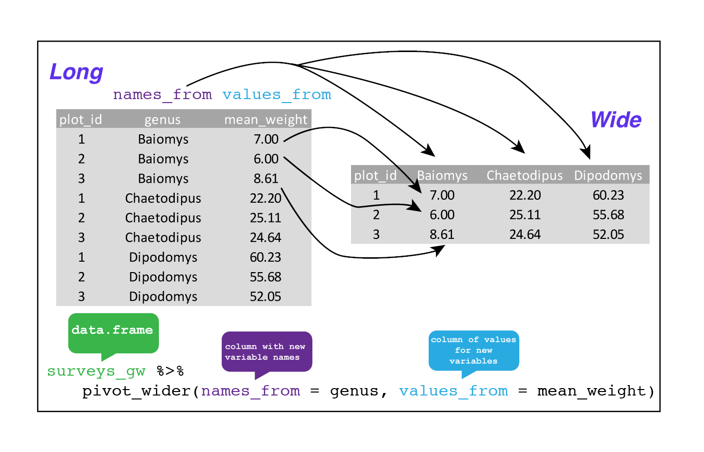
We could now plot comparisons between the weight of genera in different plots, although we may wish to fill in the missing values first, using the values_fill argument. Note: be careful when replacing NA with zero, since a mean_weight of would be recognised as an actual measurement, and not as a missing value!
surveys_gw %>%
  pivot_wider(
    names_from = genus,
    values_from = mean_weight,
    values_fill = list(mean_weight = 0)
    )
Lengthening data with pivot_longer
The opposing situation could occur if we had been provided with data in the form of surveys_wider, where the genus names are column names, but we wish to treat them as values of a genus variable instead.
In this situation we are lenghtening the data by taking the column names and turning them into a pair of new variables. One variable represents the column names as values, and the other variable contains the values previously associated with the column names.
pivot_longer() takes four principal arguments:
- the
data - the
colscontaining the names of the columns we want to pivot into a longer format - the
names_tocontaining a string specifying the name of the column to create from the data stored in the column names ofdata - the
values_tocontaining a string specifying the name of the column to create from the data stored in cell values.
To recreate surveys_gw from surveys_wider we would create a column using names_to called genus. We would also need to create a column called mean_weight using the values_to argument. Lastly, we would use all columns apart from plot_id to pivot into a longer format. Here we drop plot_id column with a minus sign.
surveys_longer <- surveys_wider %>%
  pivot_longer(
    cols = -plot_id,
    names_to = "genus",
    values_to = "mean_weight")
str(surveys_longer)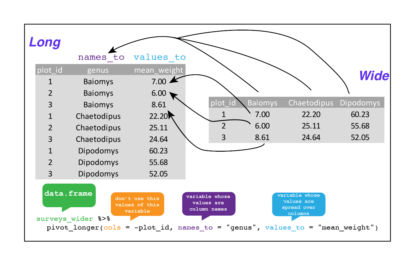
Note that now the NA genera are included in the longer format. Making data wider and then longer can be a useful way to balance out a dataset so every replicate has the same composition.
We could also have used a specification for what columns to include. This can be useful if you have a large number of identifying columns, and it’s easier to specify what to gather than what to leave alone. And if the columns are in a row, we don’t even need to list them all out - just use the : operator!
surveys_wider %>%
  pivot_longer(
    cols = Baiomys:Spermophilus,
    names_to = "genus",
    values_to = "mean_weight") %>%
  head()
Challenge
- Take the
surveysdata frame and make it wider, usingyearas columns,plot_idas rows, and the number of genera per plot as the values. You will need to summarise before reshaping, and use the functionn_distinct()to get the number of unique genera within a particular chunk of data. It’s a powerful function! See?n_distinctfor more.Answer
surveys_wider_genera <- surveys %>%
  group_by(plot_id, year) %>%
  summarise(n_genera = n_distinct(genus)) %>%
  pivot_wider(names_from = year, values_from = n_genera)

head(surveys_wider_genera)
- Now take that data frame and
pivot_longer()it again, so each row is a uniqueplot_idbyyearcombination.Answer
surveys_wider_genera %>%
  pivot_longer(
  cols = -plot_id,
  names_to = "year",
  values_to = "n_genera")
- The
surveysdata set has two measurement columns:hindfoot_lengthandweight. This makes it difficult to do things like look at the relationship between mean values of each measurement per year in different plot types. Let’s walk through a common solution for this type of problem. First, usepivot_longer()to create a dataset where we have a key column calledmeasurementand avaluecolumn that takes on the value of eitherhindfoot_lengthorweight. Hint: You’ll need to specify which columns are being pivoted.Answer
surveys_long <- surveys %>%
  pivot_longer(
  cols = c(hindfoot_length, weight),
  names_to = "measurement",
  values_to = "value")
- With this new data set, calculate the average of each
measurementin eachyearfor each differentplot_type. Then make the data set wider usingpivot_wider()with a column forhindfoot_lengthandweight. Hint: You only need to specify the name and value columns forpivot_wider().Answer
surveys_long %>%
  group_by(year, measurement, plot_type) %>%
  summarise(mean_value = mean(value, na.rm = TRUE)) %>%
  pivot_wider(names_from = measurement, values_from = mean_value)
Reshaping data - joining tables
Often data is spread out over multiple tables, instead of in one large, single table. Why collect data in multiple tables? - Not efficient to include all information in a single table. - Redundant information makes it more difficult to update or revise data. - Make changes in one place, not hundreds of places. - Use multiple tables - Each table contains a single kind of information, for example in our case we could split the data into three tables: - surveys: information about individuals - species: information about species - plots: information about plots - If a species name changes we only need to change it in the species table - Connect tables using joins to describe relationships between tables
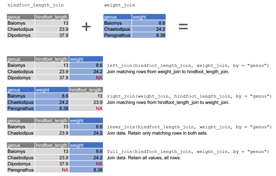
To illustrate the joining of different tables we will create two tables: hindfoot_length_join and weight_join, which contain the average hindfoot_length and weight per genus, respectively. To simplify the example, we are only using three genera, two of which are common between the tables. These are taken using the slice function. For more information, see ?slice.
# Create a summary table for mean hindfoot_length
hindfoot_length_join <- surveys %>%
  group_by(genus) %>%
  summarise(hindfoot_length = mean(hindfoot_length, na.rm = TRUE)) %>%
  slice(4,8,11)

# Create a summary table for mean weight
weight_join <- surveys %>%
  group_by(genus) %>%
  summarise(weight = mean(weight, na.rm = TRUE)) %>%
  slice(4,8,15)

hindfoot_length_join
#> # A tibble: 3 x 2
#> genus hindfoot_length
#> <chr> <dbl>
#> 1 Baiomys 13
#> 2 Chaetodipus 23.9
#> 3 Dipodomys 37.9weight_join#> # A tibble: 3 x 2
#> genus weight
#> <chr> <dbl>
#> 1 Baiomys 8.6
#> 2 Chaetodipus 24.2
#> 3 Perognathus 8.38As can be seen above, the Baiomys and Chaetodipus genera are common between the two tables. Dipodomys only occurs in hindfoot_length_join and Perognathus only in weight_join.
Joining of tables is done using the mutating join functions in dplyr documentation. All of join functions take three arguments, two table names (the tables to join, the left-hand side and right-hand side) and a common key defined in by =. Here we look at the four most commonly used join functions, which are illustrated in the image below.
left-join. This joins matching rows from the right-hand side table to the left-hand side table.right_join. This joins matching rows from the left-hand side table to the right-hand side table.inner_join. This retains only rows that occur in both tables.full_join. This retains all values from all rows.
In this case we want to join the data by genus, so we use by = genus as the common key.
Further visualisations
Facetting
The ggplot2 package has a way of creating different plots based on the different categories in the data. This is known as facetting. With facetting we do not need to use group_by() to split the data into different groups to be able to plot the different categories in different plots as ggplot2 does this automatically.
There are two types of facet functions:
facet_wrap()arranges the different plots into muliple rows and columns to cleanly fit on one page.facet_grid()plots all the categories in 1 row or 1 column.
Let us see this in action. When we plotted a time series plot, we created a line for each different genus. Given there are several genera, it would be more clearer if we plotted each line is a seperate plot, one plot for each genus. Facetting will do this very easily. Let us start with facet_wrap(). We supply the variable that we would like to group upon within vars() as following:
ggplot(data = yearly_counts, mapping = aes(x = year, y = n)) +
    geom_line() +
    facet_wrap(facets = vars(genus))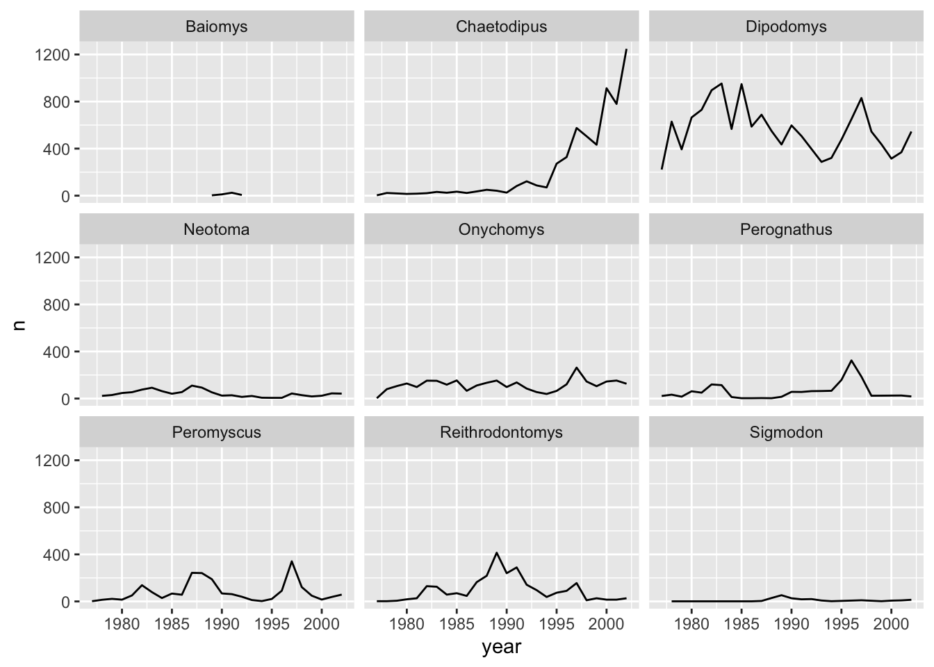
As you can see, each genus has been plotted as a separate plot. It is now clear which are the genera that were observed the most. Another advantage of facetting is that it uses a common axes and all plots are aligned to the same values on the axes, making the different plots comparable. If you want to have different axes for each plot you can do so by using the scales argument.
ggplot(data = yearly_counts, mapping = aes(x = year, y = n)) +
    geom_line() +
    facet_wrap(facets = vars(genus), scales = "free")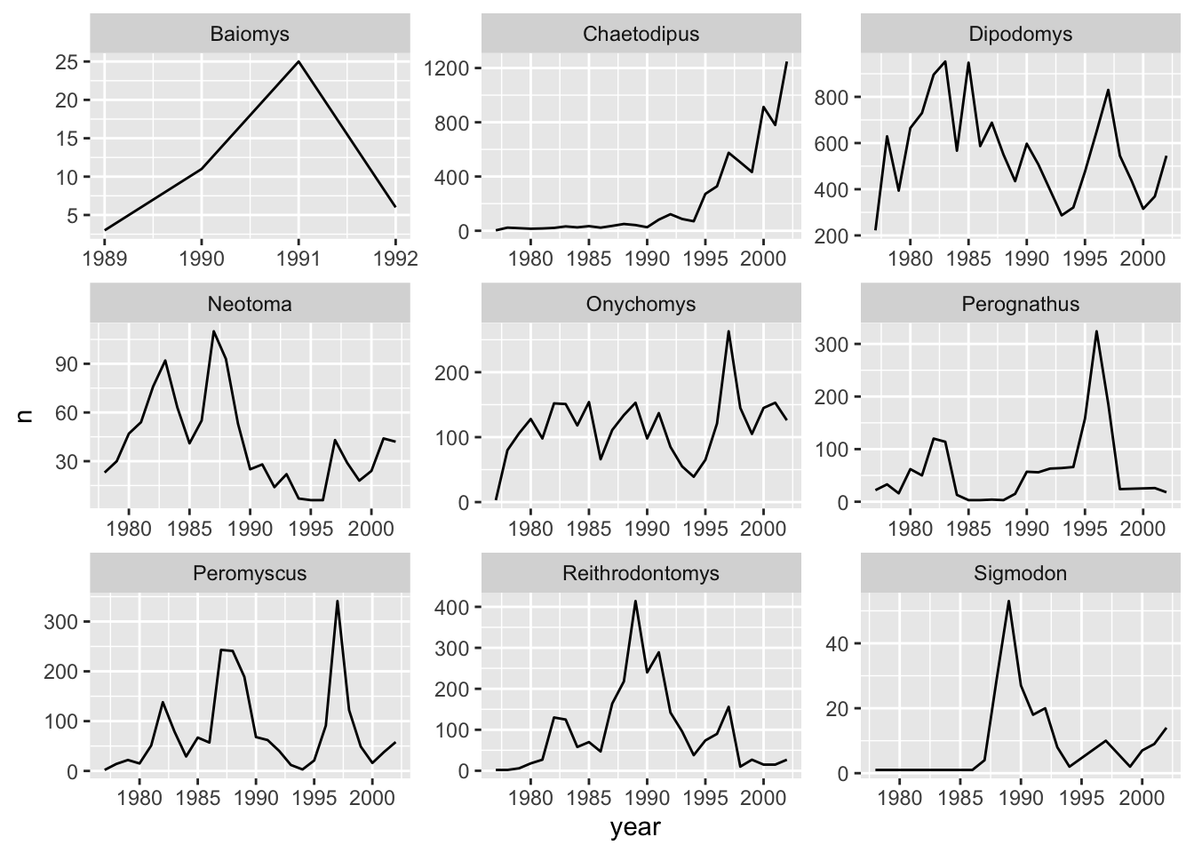
The pattern of the graphs that before were hardly visible, e.g., Baiomys, is now clear as the axes have been rescaled to fit the data. This is the main advantage of using free scales. The disadvantage is that the different plots are not comparable as before.
If we would like to see if there is any difference between the sex, we can do this by adding sex as another grouping to count().
yearly_sex_counts <- surveys_complete %>%
                      count(year, genus, sex)
yearly_sex_counts will now look like:
#> # A tibble: 389 x 4
#>     year genus           sex       n
#>    <dbl> <chr>           <chr> <int>
#>  1  1977 Chaetodipus     F         3
#>  2  1977 Dipodomys       F       103
#>  3  1977 Dipodomys       M       119
#>  4  1977 Onychomys       F         2
#>  5  1977 Onychomys       M         1
#>  6  1977 Perognathus     F        14
#>  7  1977 Perognathus     M         8
#>  8  1977 Peromyscus      M         2
#>  9  1977 Reithrodontomys F         1
#> 10  1977 Reithrodontomys M         1
#> # … with 379 more rows
This should now allow us to also split by sex. We can use colour to distinguish between the sex categories:
ggplot(data = yearly_sex_counts, mapping = aes(x = year, y = n, colour = sex)) +
  geom_line() +
  facet_wrap(facets = vars(genus))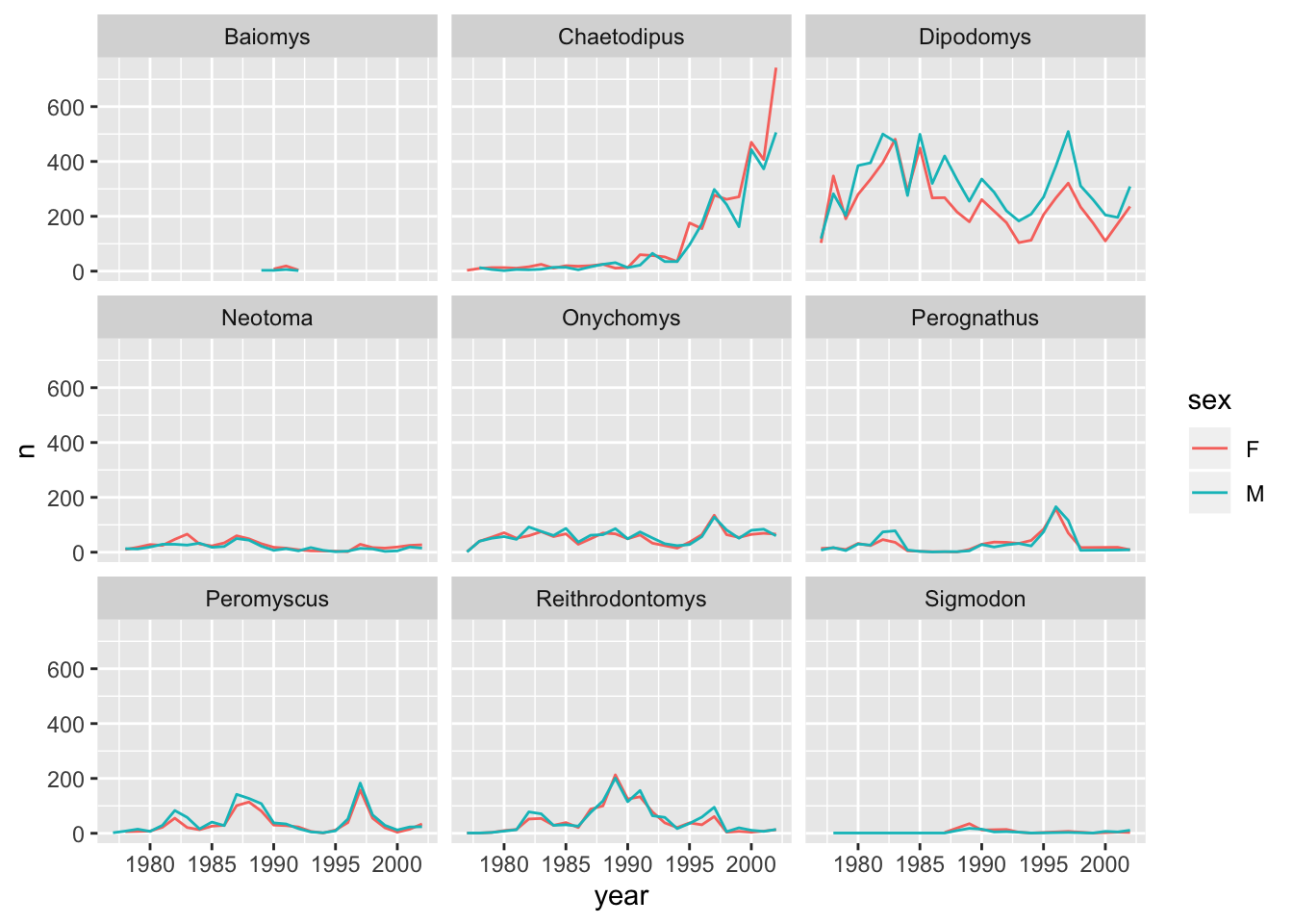
Let us do the same thing with facet_grid() so that we can understand the difference between the two facetting techniques in the ggplot2 package. With facet_grid() you specify what variable you would like to split on as in the rows or cols arguments:
ggplot(data = yearly_counts, mapping = aes(x = year, y = n)) +
    geom_line() +
    # Display the genera as columns
    facet_grid(cols = vars(genus))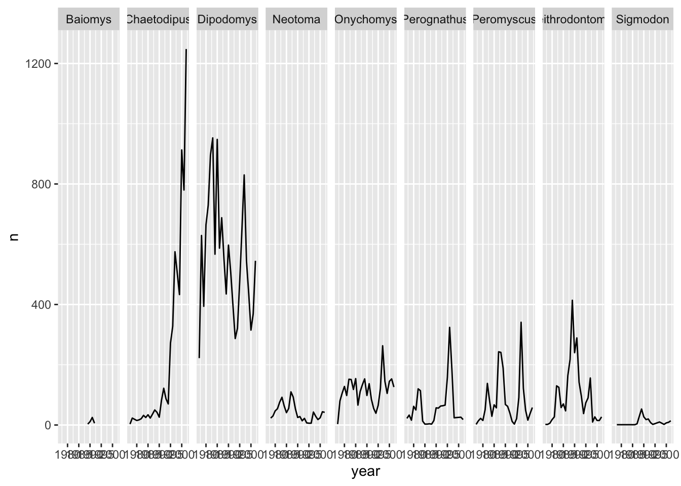
As you can see facet_grid() placed all the categories of genus in 1 row, unlike facet_wrap() which have spread them over multiple rows to fit well in 1 page. Let us split the plots by sex as well by plotting sex as the rows:
ggplot(data = yearly_sex_counts,
  mapping = aes(x = year, y = n)) +
  geom_line() +
  facet_grid(rows = vars(sex), cols = vars(genus))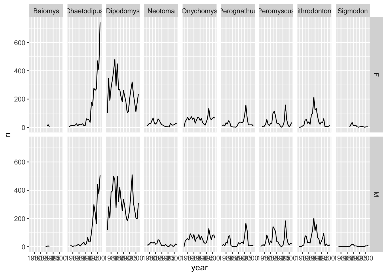
More information on further functionality of facetting can be found in the
facet_wrap()andfacet_grid()documentation.
Challenge
Instead of splitting the plots based on
sexdisplay thesexas different coloured line graphs in the same plot.Answer
ggplot(data = yearly_sex_counts,
 mapping = aes(x = year, y = n, colour = sex)) +
 geom_line() +
 facet_grid(cols = vars(genus))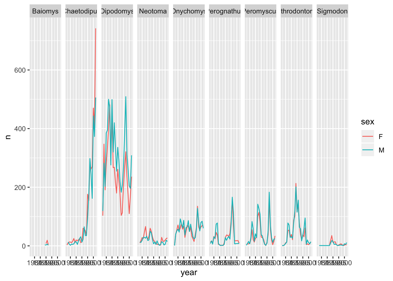
Customisation
Though the default visualisation of ggplot2 plots is already at a good standard, there are several ways one can improve even further the visualisations.
Labels
Let us start customising the last plot we have plotted by renaming the axes and adding a title to the plot. This is done by using the labs function:
ggplot(data = yearly_sex_counts, mapping = aes(x = year, y = n)) +
  geom_line() +
  facet_grid(cols = vars(genus)) +
  labs(title = "Observed genera through time",
       x = "Year of observation",
       y = "Number of animals")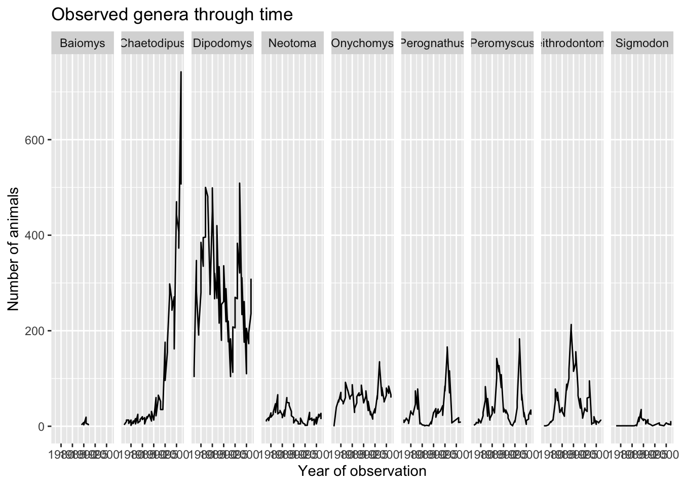
The major item that needs fixing in the plot is the text on the x-axis as this crammed and is not readable at the moment. This is mainly due to the fact that the size of the plot is dependent on the size of the window (in this case RStudio). You can work around this by saving your plot to a file and specifying the width of the plot (see Saving a plot to a file section). Themes in the ggplot2 package control the display of all non-data elements of the plot. Let us start customising the text on the x-axis by changing its size and position using the theme function. Note that theme() has several other arguments and you can read more about them in the theme() documentation.
ggplot(data = yearly_sex_counts, mapping = aes(x = year, y = n, colour = sex)) +
    geom_line() +
    facet_grid(cols = vars(genus)) +
    labs(title = "Observed genera through time",
         x = "Year of observation",
         y = "Number of animals")  +
    theme(axis.text.x = element_text(size = 7, angle = 90, vjust = 0.5),
          axis.text.y = element_text(size = 7),
          strip.text=element_text(size = 7, angle = 45))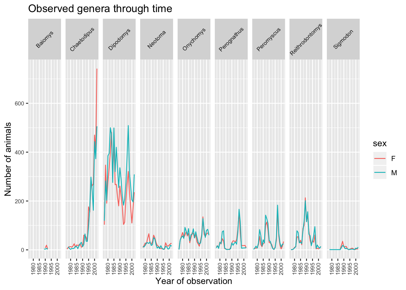
Legend
With the plot already looking better, the last thing we would like to change is the legend. Legends are very tricky in ggplot2 as the fuction to use is determined by the data that is being displayed. In this case the legend has been created based on colour groupings. Therefore we can change the lengend title, categories and colour as follows:
ggplot(data = yearly_sex_counts, mapping = aes(x = year, y = n, colour = sex)) +
    geom_line() +
    facet_grid(cols = vars(genus)) +
    labs(title = "Observed genera through time",
         x = "Year of observation",
         y = "Number of animals")  +
    theme(axis.text.x = element_text(size = 7, angle = 90, vjust = 0.5),
          axis.text.y = element_text(size = 7),
          strip.text = element_text(size = 7, angle = 45)) +
    scale_colour_brewer("Sex",
                       palette = "Set1",
                       breaks = c("F", "M"),
                       labels = c("Female", "Male"))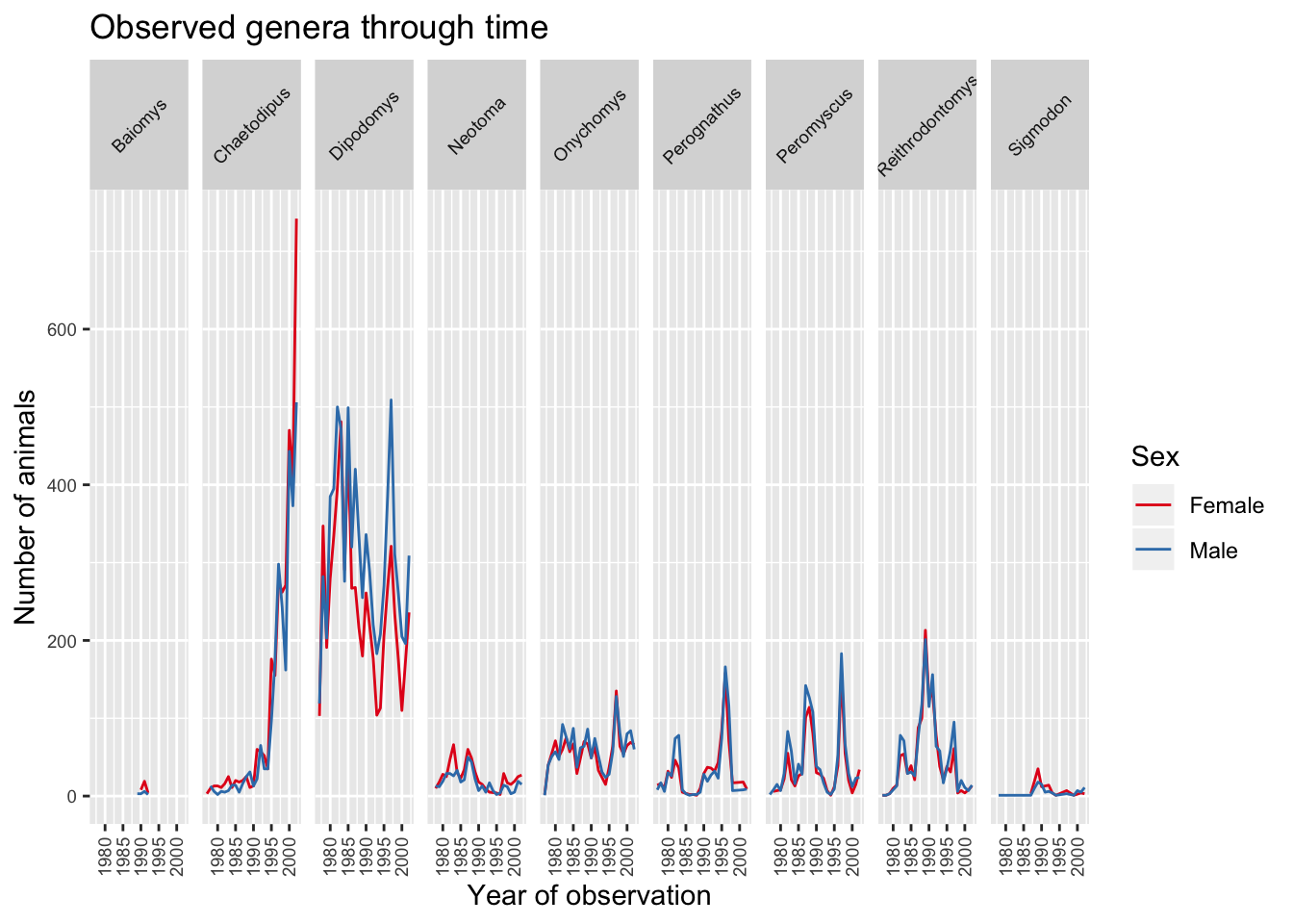
Note: If you would like to see what other palettes are available please see http://colourbrewer2.org/#type=qualitative&scheme=Set1&n=3.
Themes
ggplot2 has a set of themes that can be used to change the overall appearance of the graph without much effort. For example, if we create the first plot again and apply the theme_bw() theme we get a more simpler white background:
ggplot(data = surveys, mapping = aes(x = weight, y = hindfoot_length)) +
  geom_point() +
  theme_bw()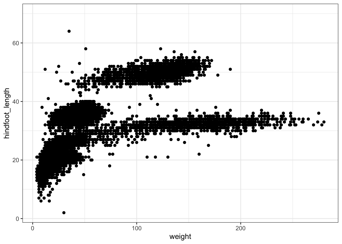
A list of themes can be found in the ggplot2 documentation.
Challenge
Use what you just learned to create a plot that depicts how the average weight of each species changes through the years.
Answer
surveys_complete %>%
 group_by(year, species) %>%
 summarise(avg_weight = mean(weight)) %>%
 ggplot(mapping = aes(x = year, y = avg_weight)) +
   geom_line() +
   facet_wrap(facets = vars(species)) +
   theme_bw() +
   theme(axis.text.x = element_text(angle = 90, vjust = 0.5))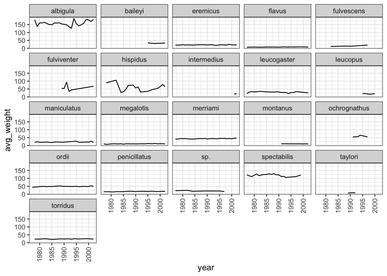
Exporting/Writing data to files
Now that you have learned how to use dplyr to transform your raw data, you may want to export these new datasets to share them with your collaborators or for archival.
Similar to the read_csv function used for reading CSV files into R, there is a write_csv function that generates CSV files from data frames and tibbles which is also present in the readr package.
Before using write_csv(), we are going to create a new folder, data_output, in our working directory that will store this generated dataset. We don’t want to write generated datasets in the same directory as our raw data. It’s good practice to keep them separate. The data folder should only contain the raw, unaltered data, and should be left alone to make sure we don’t delete or modify it. In contrast, our script will generate the contents of the data_output directory, so even if the files it contains are deleted, we can always re-generate them.
Let us save the surveys_complete tibble in data_output/surveys_complete.csv file:
write_csv(surveys_complete, path = "data_output/surveys_complete.csv")